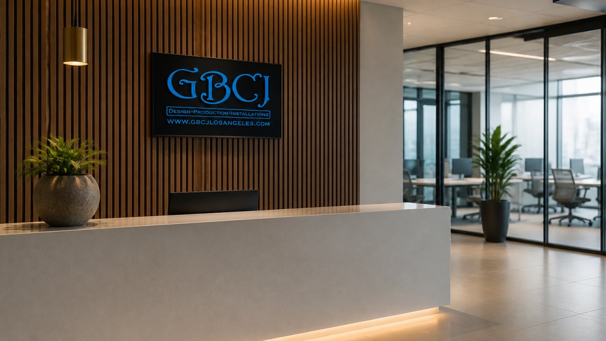
 listicle
How Can Startups Brand a Modern Reception Area?
Last Updated: October 25, 2026
Quick Summary
Reception area branding is the deliberate use of signage, materials, lighting, and layout in a lobby to express a company's identity the moment someone walks in. For startups, spend first on the wall behind the reception desk, then lighting, wayfinding, and millwork last, so the lobby looks finished at every stage.
- Phase your lobby in this order: logo wall, lighting, wayfinding, then desk and millwork.
- Under $500, paint the wall behind the desk a brand color and add a clean vinyl logo.
- Dimensional letters are the single highest-impact change you can make to a reception area.
- Choose room signs that slide into frames so a reorg does not force a wayfinding reprint.
- Track front-desk questions and visitor recall to measure whether your branding works.
Table of Contents
- Why Reception Area Branding Decides the First Impression
- Office Reception Design Ideas That Fit a Startup Budget
- Office Logo Wall Ideas Beyond a Plain Vinyl Decal
- Custom Office Signage: Materials, Finishes, and What Lasts
- Office Wayfinding Signage for Visitors and Hybrid Teams
- Digital and Interactive Reception Area Branding
- Accessibility and Inclusive Visitor Experience
- How to Measure Whether Your Reception Branding Works
- Frequently Asked Questions
Why Reception Area Branding Decides the First Impression
Reception area branding is the deliberate use of signage, materials, lighting, and layout in a lobby to express a company's identity the moment someone walks in.
Here is the part most guides get wrong. They treat the lobby as decoration. It is not. It is the only room every visitor sees, and it is judged in seconds, before anyone speaks.
The good news for early-stage companies is that reception area branding rewards decisions, not dollars. Get the logo wall, the desk, the lighting, and the wayfinding right and a modest space reads as confident. Miss those and a large space reads as confused.
Below, we break down the modern reception area branding ideas for startups that hold up in practice, tiered by budget and sorted by what actually moves a first impression.
Office Reception Design Ideas That Fit a Startup Budget
Start with the budget tiers, because they decide everything else. A startup can build a credible office reception on a tight number if it spends on the wall behind the desk and treats everything else as supporting cast. The unique angle here is phasing: most guides hand you a shopping list, but a startup needs a sequence that lets the lobby look finished at every stage, not half-built until the last invoice clears.
Tiered Budget Options: Under $500, $500-$2,000, and $2,000+
| Budget Tier | What to Prioritize | What to Skip for Now | Typical Cost Drivers |
|---|---|---|---|
| Under $500 | Vinyl wall graphics, a painted accent wall, printed canvas, plant rentals | Custom millwork, illuminated signs, digital displays | Wall area square footage, number of colors, install labor minimums |
| $500-$2,000 | Acrylic or dimensional logo sign, frosted glass film, a few wayfinding decals | Full reception rebuilds, interactive screens | Letter count and height, material thickness, whether the wall needs blocking |
| $2,000+ | Custom dimensional letters, layered lighting, custom reception counter, digital display | Nothing, but phase it in stages | Millwork linear feet, electrical drops, display size and mount |
At the lowest tier, the goal is a tidy workspace with one strong focal point. Paint the wall behind the reception desk a brand color, add a clean vinyl logo, and keep the counter clear. That combination beats a cluttered room with expensive furniture.
The middle tier is where most startups land, and it is the best value. A dimensional logo in acrylic or metal, frosted glass on the conference room windows, and a small wayfinding set cover the three things visitors notice. We would spend the budget here rather than on furniture.
The top tier buys permanence: custom millwork, layered lighting, and a reception counter built to your brand. If you are planning a longer lease, this is worth doing in one pass.
For a deeper breakdown of what to consider at the entry level, see our guide to affordable custom signage for small offices.
Office Logo Wall Ideas Beyond a Plain Vinyl Decal
The logo wall is where office logo wall ideas earn their keep. A flat vinyl decal is fine as a placeholder, but it disappears under lobby lighting and reads as temporary.
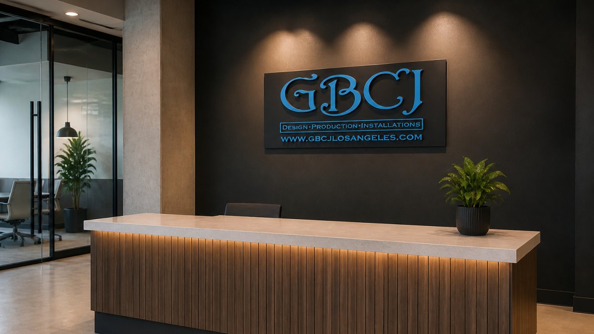
Dimensional letters stand off the wall and cast a shadow, which gives the company logo depth and presence. This is the single highest-impact change you can make to a reception area.
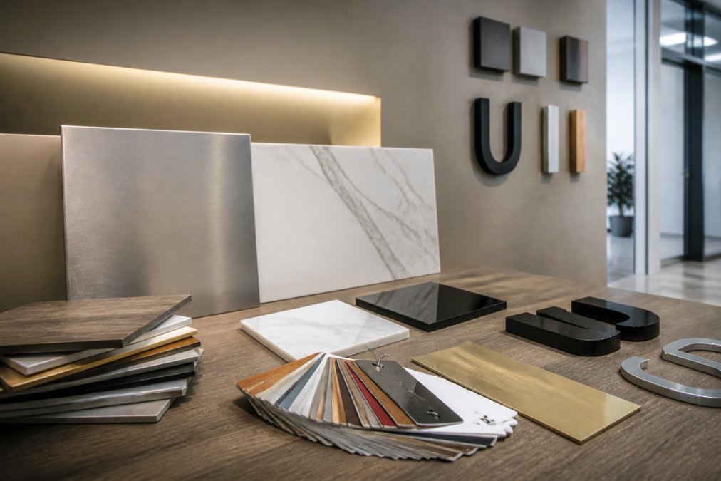
Layered materials combine a backer panel with cut letters on top. A wood or brushed metal backer with acrylic letters reads as considered design rather than a print job.
Backlit halo letters throw light back onto the wall, so the brand name glows without glare.
If you want a wall that reflects your brand's message and style, our team can design and install a custom lobby sign built around your logo.
Custom Office Signage: Materials, Finishes, and What Lasts
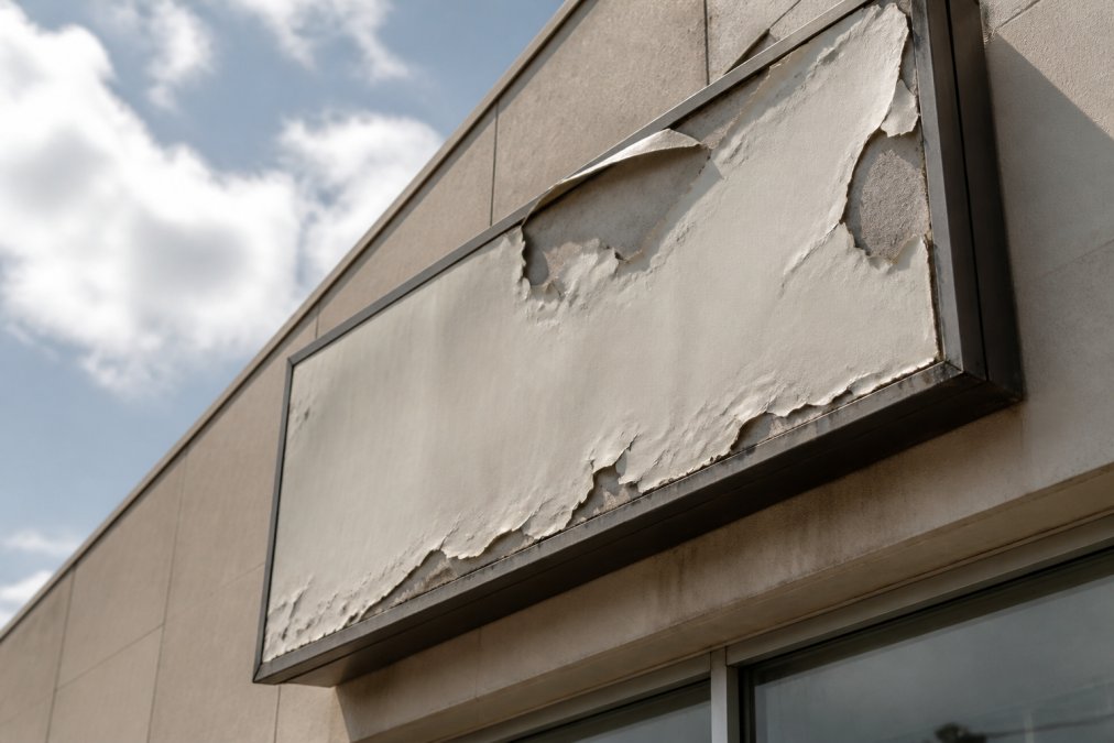
Custom office signage lives or dies on material choice. The wrong material looks tired within a year, and swapping it costs more than buying right the first time.
- Acrylic: crisp edges, good color depth, works indoors, scratches if cleaned carelessly
- Brushed metal: premium look, hides fingerprints, heavier and needs proper mounting
- Frosted glass film: privacy for glass walls with a clean, modern finish
- Vinyl graphics: cheapest and fastest, best for temporary or low-traffic walls
- Cut letters in PVC or foam: light, affordable, good for interior dimensional letters
Finish matters as much as material. Matte finishes hide smudges in high-touch areas. Gloss shows every fingerprint on a reception counter. Edge quality separates a professional sign from a kit: laser-cut or polished edges catch light, while rough edges look cheap up close.
Watch out: mounting heavy metal letters into drywall without blocking behind it is the most common failure we see. The sign sags or pulls free within months. Plan the wall structure before you order.
For a fuller comparison of indoor materials and how they hold up, read our breakdown of the best materials for durable indoor office signage.
Office Wayfinding Signage for Visitors and Hybrid Teams
Office wayfinding signage answers one question: can a first-time visitor find their way without asking? In a hybrid office, the answer matters more, because half the people walking in have never been there.
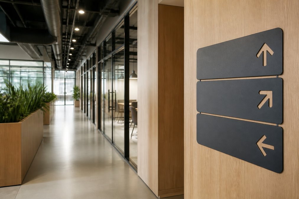
Start with the path a visitor actually takes: entrance, front desk, waiting spot, meeting room, restroom. Sign each decision point, not every door. A small set of clear, consistent signs beats a wall of labels.
- Directional signs at corridor junctions
- Room identification at eye level, not above the frame
- A simple floor directory at the entrance
- Consistent typeface, color, and icon style across every sign
Hybrid teams need one extra piece: signage that works when the front desk is unstaffed. A clear directory and a visible "check in here" sign let a visitor self-orient on a quiet day.
Modularity is the other hybrid requirement. Choose room signs that slide into a frame rather than being adhered directly to the wall, so a room can change from "Focus Room" to "Huddle" without a new sign.
Keep the system small and consistent. Five matching signs read as professional; fifteen mismatched ones read as an afterthought, and that undercuts the brand image you built at the door. Consistency is also a maintenance strategy: one typeface, one color, one icon set means replacement parts match the originals years later.
Digital and Interactive Reception Area Branding
Digital displays add motion and flexibility that printed signage cannot match, and prices on commercial displays have come down enough for small offices to consider them.
Use a screen for what changes: welcome messages, meeting room schedules, company news, or a rotating brand video. Keep printed signage for what stays fixed, like the logo wall and room names.
A few practical rules keep digital from looking cheap. Mount the screen at eye level, hide the cables, and set a slow, simple loop.
Interactive elements, such as a touchscreen directory or a self check-in kiosk, suit offices with regular visitor volume.
If you are weighing current design directions for the front of house, our guide to indoor office signage design trends covers what is working now and what to avoid.
Accessibility and Inclusive Visitor Experience
Accessibility is not a nice-to-have in a reception area. It is the difference between a visitor who feels welcome and one who feels like an obstacle.
Start with the basics: signs at a readable height, high contrast between text and background, and large enough lettering to read from a standing distance.
Under the Americans with Disabilities Act, signage for permanent rooms must meet specific requirements for raised characters, braille, and mounting height.
Beyond compliance, think about the whole visit. Is there seating for someone who cannot stand long? Is the front desk at a height a wheelchair user can reach? Is the path from door to desk clear?
For offices planning this carefully, our ADA compliant signage guide walks through the requirements in detail.
How to Measure Whether Your Reception Branding Works
Most companies never check whether the lobby is doing its job. A few simple measures tell you if the investment is paying off.
- Visitor recall: ask a new client, days later, what they remember about the office. If they name your logo or a color, the branding landed.
- Front-desk questions: track how often visitors ask where to go. Fewer questions means wayfinding is working.
- Photo and video backdrop: count how often guests photograph themselves in the lobby. A branded wall that people share is free marketing.
- Recruiting feedback: ask candidates if the space felt like a place they would want to work.
- Sales cycle notes: note whether prospects mention the office in follow-up conversations.
None of these require a survey budget. A shared note and a monthly review are enough. The point is to treat the reception area as a working asset and adjust it when the evidence says it is not working.
That is the throughline here: reception area branding is a set of decisions you can measure and improve, not a one-time decoration. Start with the wall behind the desk, spend where visitors look, and check the result.
Frequently Asked Questions
How can a startup make its reception area look professional on a budget?
Focus spending on one focal point instead of spreading it across the whole room. A single well-made logo wall or dimensional letter sign carries more weight than five cheap pieces around it. Paint the walls a single neutral color, add warm lighting, keep the desk clear, and put the rest of the budget into one quality sign. Reception area branding works best when one element is clearly the star and the rest supports it.
What type of signage works best in an office reception area?
Dimensional letters and acrylic or metal lobby signs hold up best because they read clearly and look finished up close. Vinyl graphics and frosted glass film cost less and suit rented spaces where you cannot drill into walls. For custom office signage, match the material to the wall: drywall handles mounted letters, glass suits frosted film, and textured surfaces need standoff hardware. Ask your fabricator to confirm mounting before you approve a design.
How can startups make reception signage accessible and easy to read?
Use high-contrast lettering, large enough type for someone standing several feet away, and avoid thin script fonts on signs that need to be read quickly. Add raised or tactile elements for key room labels, and keep wayfinding signs at a consistent height so visitors know where to look. Good office wayfinding signage also pairs text with simple icons and places direction changes at decision points, not at the end of a hallway.
How do you measure whether reception area branding is working?
Track a few simple signals: how often visitors comment on the space, whether clients mention the office when they refer others, and whether new hires say the lobby matched what they expected from the company. You can also ask a short question on your post-meeting survey about the office experience. Compare results before and after a refresh. These measures are qualitative, so treat trends over several months as the signal, not a single data point.
A reception area that looks unfinished quietly costs you clients who never say why they did not call back. If your lobby is sending the wrong signal, we can help you fix it. At GBCJ Los Angeles, we design and fabricate custom dimensional letters, lobby signs, and vinyl graphics, and we work closely with small businesses to get the design right the first time. Get started with GBCJ Los Angeles and turn your front desk into a first impression that earns the meeting.