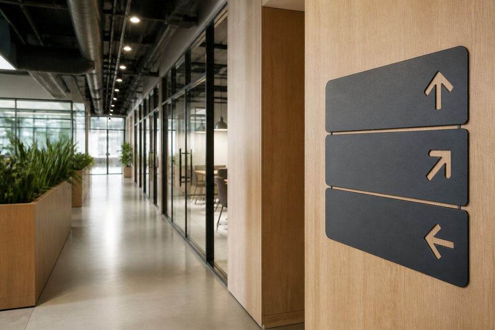
 listicle
Indoor Office Signage Design Trends 2026: A Practical Guide
Table of Contents
- Why Indoor Office Signage Matters More Than Ever in 2026
- Top Indoor Office Signage Design Trends for 2026
- Digital Signage for Corporate Offices: Hyper-Personalization and AI Integration
- Common Mistakes in Office Signage Design
- ADA Compliant Office Signage Requirements: What You Need to Know
- How to Plan Your Office Signage Project: A Step-by-Step Checklist
- Conclusion
- Frequently Asked Questions
Last Updated: September 20, 2026
Why Indoor Office Signage Matters More Than Ever in 2026
Indoor office signage design trends 2026 reflect a workplace that has changed shape. Hybrid schedules mean fewer people in the building on any given day, so every sign has to work harder to orient visitors, reinforce culture, and communicate brand identity in seconds. At GBCJ Los Angeles, we have spent over 15 years in the graphics and sign industry, and the shift we see is clear: signage is no longer decoration. It is infrastructure.
That matters because a lobby sign is often the first physical brand touchpoint a client, candidate, or vendor encounters. When it is well designed, it sets expectations before anyone speaks. When it is an afterthought, it quietly undercuts everything else in the space. This guide covers the design trends shaping office environments in 2026, plus the compliance rules and planning steps most trend articles skip.
Top Indoor Office Signage Design Trends for 2026
The strongest trend of the year is intentionality. Office managers are moving away from generic plaque-and-vinyl setups toward layered systems that combine typography, material, and light.
Bold Typography and Nostalgic Imagery
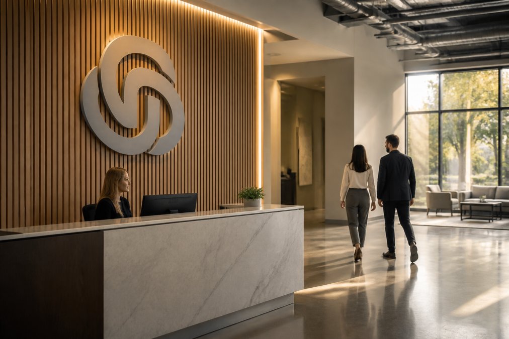
Oversized letterforms are back, but not in the flat, corporate way of the past decade. Expect dimensional serif type, retro color palettes, and photographic murals that reference the company's history. The goal is warmth. A wall of vintage product photos tells a story that a gray acrylic logo cannot.
Tactile and Dimensional Signage
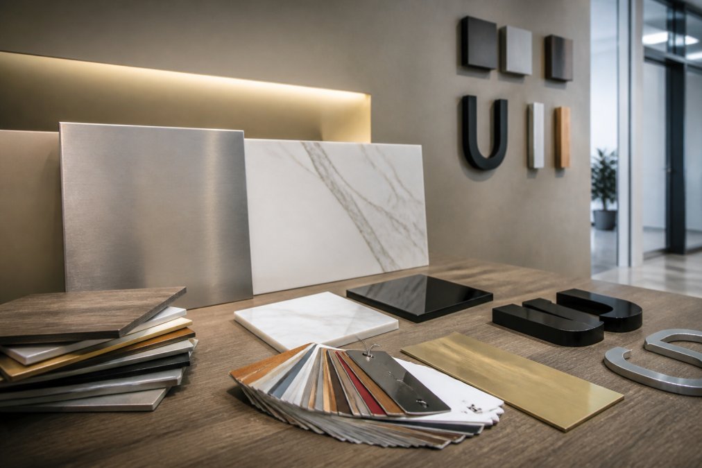
Flat vinyl still has its place for wayfinding, but feature walls now lean toward tactile design: brushed metal, routed wood, layered acrylic, and backlit elements that invite touch. These materials photograph well, which matters when employees and visitors share your space online.
Inclusive and Accessible Design
Accessibility is no longer a final checkbox. Contrast ratios, letter height, mounting height, and braille placement are being designed in from the start. This is where aesthetic trends and accessibility standards intersect, and the projects that handle both well look better, not more clinical.
Sustainable and Eco-Friendly Materials
Recycled acrylics, reclaimed wood, and low-VOC finishes are showing up in more specifications. Material sustainability is now a selling point for tenants and a genuine cost consideration over the life of a sign.
Digital Signage for Corporate Offices: Hyper-Personalization and AI Integration
Digital signage for corporate offices has moved past looping slideshows. Modern systems pull from calendar data, room booking tools, and visitor management platforms to display the right message at the right moment. A screen outside a conference room can show the meeting name, the attendees, and the remaining time. A lobby display can greet a scheduled visitor by name.
The practical win is hyper-personalization without extra labor. AI-driven content tools schedule and swap messaging automatically, so a facilities team is not rebuilding graphics every Monday. The trade-off: digital displays need power, network access, and a content owner. If no one owns the screen, it becomes a frozen menu from three months ago, which damages brand identity more than having no screen at all.
What the Hardware Stack Actually Looks Like
Most corporate deployments in 2026 follow one of three patterns, and the choice drives both cost and maintenance burden:
- Commercial-grade displays with an external media player. A 55-inch 4K commercial panel (rated for 16/7 or 24/7 duty cycles, unlike consumer TVs) paired with a small form-factor PC or dedicated player. Highest flexibility, most points of failure.
- System-on-chip (SoC) displays. The player is built into the panel. Fewer cables, fewer failure points, and easier remote management, but you are locked into that manufacturer's content platform.
- Video walls and LED tiles. Used for lobbies and feature walls. Higher brightness and seamless bezels, but power, heat, and structural support requirements are substantially greater than a hung panel.
A common pattern is to standardize on one platform across the portfolio so a single content manager can push updates to every building. Mixed platforms are the leading cause of abandoned screens.
Integration with Smart Building Systems
This is where most trend articles stop, and where the real operational value sits. Modern digital signage can act as an endpoint on the building management system (BMS) rather than a standalone appliance. Practical integrations include:
- Room booking and occupancy data feeding live "available / in use" states outside meeting rooms, pulled from the same platform employees already use to reserve space.
- HVAC and lighting coordination so a display dims or powers down when a floor is unoccupied, cutting always-on energy draw.
- Visitor management handoff, where a check-in at the lobby kiosk triggers a welcome screen and a directional prompt for the host.
- Emergency messaging override, allowing life-safety notifications to preempt scheduled content, a requirement many facilities teams only discover during an incident.
If you are specifying signage as part of a smart-building rollout, confirm three things before purchase: the display platform's API access, whether it supports the building's network segmentation policy, and who holds the override authority for emergency content.
Measuring Whether It Actually Works
Digital signage is easy to install and hard to justify without metrics. The signals worth tracking are the ones tied to a business outcome, not vanity impressions:
- Meeting room utilization before and after installing availability displays, the clearest ROI case for most offices.
- Visitor check-in time at the lobby, measured from arrival to host notification.
- Content freshness, tracked as the age of the oldest live asset on each screen. A screen with content older than 30 days is effectively dead.
- Help-desk tickets related to wayfinding or "where do I go" questions, which should decline after a directional display rollout.
Common Mistakes in Office Signage Design
The most common mistakes in office signage design come from treating signs as isolated purchases instead of one system. A lobby sign in one typeface, department signs in another, and safety signage in a third creates visual noise that readers stop noticing.
Watch for these specific errors:
- Inconsistent typography across floors and departments, which forces visitors to re-learn the space
- Mounting heights that ignore sightlines from a seated position or a wheelchair
- Low-contrast color pairings that look elegant in a design file and disappear on a real wall
- No maintenance plan, so scratched vinyl and burned-out LEDs stay up for years
- Skipping the wayfinding audit, which leaves visitors guessing at elevator banks and corridors
ADA Compliant Office Signage Requirements: What You Need to Know
ADA compliant office signage requirements apply to permanent room and space signs, and they are specific. The ADA Standards for Accessible Design, Section 703 set rules for raised characters, braille, finish, and mounting location. Signs identifying rooms and spaces must include both visual and tactile characters, and they must be mounted on the wall adjacent to the door on the latch side.
| Sign Type | Tactile/Braille Required | Typical Location |
|---|---|---|
| Permanent room signs | Yes | Latch side of door |
| Overhead directional signs | No | Corridors, elevator banks |
| Temporary event graphics | No | Lobby, meeting spaces |
| Digital displays | No | Lobby, common areas |
How to Plan Your Office Signage Project: A Step-by-Step Checklist
A successful signage project starts with an inventory, not a catalog. Walk the space and document every decision point a visitor faces, then match signs to those moments.
- Audit the visitor journey from parking to your desk, noting every point of confusion
- Define your sign hierarchy: identity signs, directional signs, room signs, and safety signs
- Check compliance for all permanent room and space signs against current ADA standards
- Choose materials that match traffic levels, cleaning routines, and lighting
- Confirm mounting locations and heights before fabrication begins
- Plan the installation schedule around business hours to avoid disruption
- Set a maintenance cadence for cleaning, replacement, and digital content updates
Conclusion
The hardest part of an office signage project is not choosing a font. It is coordinating design, compliance, fabrication, and installation so the finished space feels intentional rather than assembled. Most teams underestimate the compliance review and the wayfinding audit, and those are exactly the steps that prevent costly reorders.
Frequently Asked Questions
What are the top indoor office signage design trends for 2026?
The top trends for 2026 include bold typography paired with nostalgic imagery, tactile and dimensional signage that invites touch, inclusive design that considers all abilities, sustainable materials like recycled acrylic and bamboo, and digital displays that use AI for hyper-personalization. Wayfinding and visitor experience are also central, with signage acting as a key part of spatial branding and the customer journey.
How does ADA compliance impact modern office signage design?
ADA compliance requires permanent room signs to have raised characters, Braille, and high-contrast, non-glare backgrounds. Mounting height and location are also specified. In 2026, designers are integrating these requirements more seamlessly, using tactile design as an aesthetic feature rather than an afterthought. This ensures accessibility for all visitors and employees while maintaining a cohesive brand identity.
Why is digital signage becoming essential for office interiors in 2026?
Digital signage for corporate offices is becoming essential because it supports dynamic communication, from wayfinding to real-time announcements. It also enables hyper-personalization, showing different content to different areas or times of day. Integration with smart building systems allows for automated updates, and the content can be changed instantly, offering scalability and efficiency that static signs cannot match.
What common mistakes should I avoid in office signage design?
Common mistakes in office signage design include inconsistent typography that confuses visitors, ignoring accessibility standards, using low-contrast colors that are hard to read, and overloading signs with too much information. Another mistake is choosing materials that don't hold up to daily wear or don't align with the office's aesthetic. Working with an experienced fabricator helps you avoid these pitfalls.