 how-to
Design Window Decals for Maximum Retail Visibility
Table of Contents
- Why Window Decal Design Matters for Retail Success
- Step 1: Measure Your Windows and Plan Your Layout
- Step 2: Master Contrast Ratio and Color Selection for Daytime Visibility
- Step 3: Choose the Right Vinyl and Material for Durability
- Step 4: Apply Window Decal Design Best Practices
- Step 5: Implement Retail Window Display Marketing Strategies
- Step 6: Account for Lighting, Reflection, and Distance Readability
- Step 7: Plan Installation, Maintenance, and Removal
- Frequently Asked Questions
Last Updated: September 29, 2026
Why Window Decal Design Matters for Retail Success
Your storefront window is prime real estate, the first thing potential customers see before deciding to enter. At GBCJ Los Angeles, we've spent over 15 years helping retail businesses transform windows into revenue-generating displays. The difference between a window that stops foot traffic and one that gets ignored often comes down to overlooked design choices.
A well-designed window decal communicates your brand message instantly, creates visual interest, and compels action. Poor design confuses, bores, or repels potential customers. Your window decals retail visibility directly affects foot traffic and store entry rates.
This guide covers measuring your space, selecting durable materials, applying design principles, and accounting for lighting and distance readability.
Step 1: Measure Your Windows and Plan Your Layout
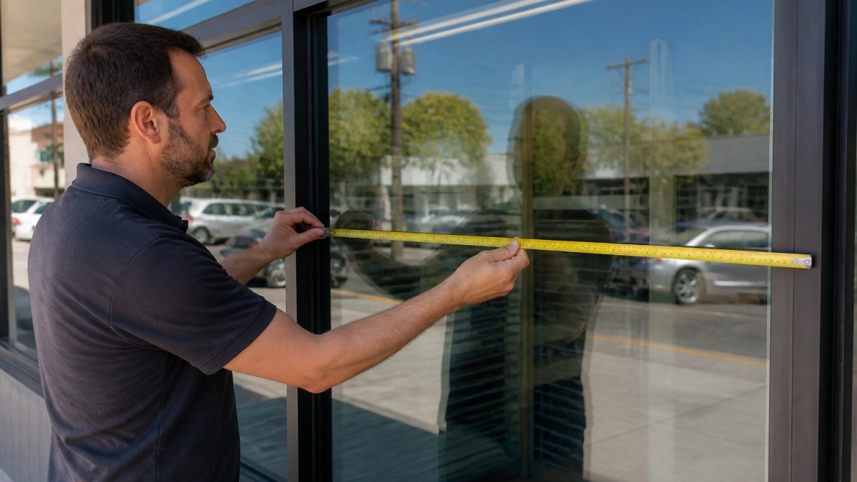
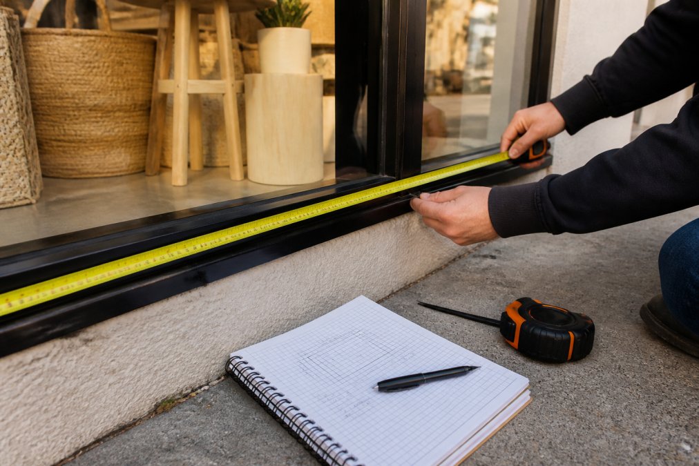
Measure your windows' width and height in inches. Note obstructions: door frames, mullions, fixtures, and reflective surfaces.
Document viewing distance, how far customers are when they first see your window. This determines font size, color contrast, and composition.
Account for Installation Surface and Obstructions
Your installation surface matters: clear glass, tinted windows, or windows with existing signage each require different approaches.
Clear glass allows perforated vinyl for visibility into your store. Tinted windows or those with displays work better with opaque decals. Existing fixtures compete with your design for attention.
Map what's behind your window. Position your window decals retail visibility messaging around product displays, not on top of them.
Step 2: Master Contrast Ratio and Color Selection for Daytime Visibility
High contrast between decal and background is essential. Use dark colors on light backgrounds, light colors on dark backgrounds.
Test color combinations in daylight, not on-screen. Bright, saturated colors grab attention faster and remain visible from greater distances.
Avoid subtle color differences. Use strong contrasts: black on white, yellow on dark blue, white on dark red, readable even when viewed quickly.
Ensure your window decals reinforce your brand. If brand colors lack contrast against your window, adjust the background or add a contrasting border.
Step 3: Choose the Right Vinyl and Material for Durability
Quality vinyl withstands weather, UV exposure, and temperature swings for years. Cheap materials peel, fade, and crack within months.
Perforated Vinyl vs. Opaque Decals vs. Clear PVC
Perforated vinyl lets light and visibility through. Use when customers should see interior displays. Requires higher contrast for readability.
Opaque decals block light completely, offering superior contrast and visibility. Trade-off: they eliminate the view into your store.
Clear PVC is transparent with printed graphics, offering design flexibility and some interior visibility. Costs more but balances both approaches.
Choose based on purpose: opaque for sales/announcements, perforated vinyl or clear PVC for brand identity with product visibility. Quality-grade materials resist UV fading for years.
Step 4: Apply Window Decal Design Best Practices
Every element should serve a purpose. Remove anything that doesn't directly support your message.
Typography, Legibility, and Line of Sight
Viewers should read your headline from at least twice the expected viewing distance. If your store is 30 feet from the sidewalk, your headline should be readable from 60 feet away.
Sans-serif fonts (Arial, Helvetica, Gotham) read faster from distance than serif fonts. Use bold, heavy fonts. Test at actual size before printing.
Place your headline or call to action in the upper left or center. Secondary information goes lower. This guides viewers through your message in order.
Visual Hierarchy and Negative Space
Make important elements larger and more prominent. Your business name or main offer should dominate; supporting text should be noticeably smaller.
Leave breathing room around main elements. Cramming every inch creates visual chaos. Negative space makes your message clearer and more professional.
Use one or two fonts maximum. Limit your color palette to three: primary, secondary, and neutral (black, white, or gray).
Step 5: Implement Retail Window Display Marketing Strategies
Your window decal should drive a specific action: enter the store, call, visit your website, or claim an offer. Before finalizing, verify compliance with local sign ordinances and zoning regulations to avoid costly removals or fines.
Verify Local Sign Ordinances and Zoning Compliance
Sign ordinances vary by jurisdiction. Some limit window decals to 25% of window area; others allow 50%. Violations can result in fines of $100-$1,000 per day and mandatory removal at your expense.
Contact your local building or planning department for the sign ordinance. Ask about:
- Maximum coverage percentage: What percentage of your window can be covered?
- Setback requirements: How far from the window edge or frame?
- Illumination rules: Are backlit or illuminated decals allowed?
- Content restrictions: Are there restrictions on political, adult, or promotional content?
- Permit requirements: Is a sign permit required? (Typically 1-2 weeks, $50-$300)
- Removal and replacement rules: Can you change decals seasonally without a new permit?
Document findings in writing. Email the planning department with a photo of your design for written compliance confirmation.
Design Your Message for Marketing Impact
Include a clear call to action: "Shop Now," "Call Today," "Limited Time Offer," or "Discover More." Make it one of the largest elements, second only to your business name or primary offer.
Highlight what makes you different: same-day service, lowest prices, locally owned. Give customers a reason to choose you.
Include one phone number or website URL. Too many contact options create confusion.
Test and Rotate Seasonal Messaging
Update your windows monthly or quarterly to promote seasonal offers or new products. Changing messaging keeps your storefront fresh.
Test your message with a temporary version before permanent installation. Does it grab attention? Can people read it from the street? Does the call to action resonate?
If your city requires permits for each new window sign, budget 2-3 weeks for approval before launching seasonal campaigns.
Track which messages perform best. Your window is a testing ground for marketing messages, use it to learn what resonates with customers.
Step 6: Account for Lighting, Reflection, and Distance Readability
Lighting transforms how your decals look. Bright sunlight and evening shadows create different effects. This determines whether customers can read your message in the 3 seconds they spend looking at your storefront.
Understanding Sun Angle and Window Orientation
Window orientation determines glare timing: east-facing (morning glare), west-facing (afternoon/evening glare), north-facing (shaded), south-facing (consistent strong light).
Glare washes out lighter colors and makes text illegible. Dark colors and high-contrast designs resist glare. Light yellow on white glass becomes nearly invisible in afternoon sun.
Test your mockup at peak traffic times. Stand across the street at expected viewing distance. Can you read the headline and call to action? If glare washes out your message, adjust color contrast or reposition the decal.
Interior and Exterior Lighting Effects
Nighttime visibility depends on interior lighting. If your window is dark at night, decals disappear into the glass.
Most retail storefronts rely on interior light spill. If nighttime visibility matters, ensure interior lighting is bright enough to backlight your graphics.
Perforated vinyl performs differently under lighting conditions than opaque decals. Perforated vinyl allows light to pass through the holes, so it remains visible at night only if there's strong interior lighting.
Distance Readability and Font Size Calculations
Distance readability is governed by visual angle, the size of an object relative to the viewer's distance from it. Text that's readable from 10 feet away will be illegible from 50 feet away unless you increase the font size proportionally.
Seasonal and Weather Variations
Sun angle changes seasonally. In summer, the sun is higher in the sky, creating different glare patterns than winter, when the sun is lower. If your storefront faces south, winter sun hits your window at a shallower angle, potentially creating more glare. Test your design in multiple seasons if possible, or at minimum in the season when your business expects peak traffic.
Step 7: Plan Installation, Maintenance, and Removal
Professional installation matters. Improper application causes bubbles, wrinkles, and premature peeling. If you're not experienced, hire a professional. If you're not experienced, hire a professional.
Frequently Asked Questions
What type of vinyl is best for business window decals?
The best vinyl depends on your visibility needs and durability requirements. Perforated vinyl allows light and visibility through the window while displaying your message, making it ideal for storefronts where you want customers to see inside. Opaque decals provide full coverage and bolder visibility for promotional messaging. Adhesive vinyl and clear PVC offer UV resistance and weatherproofing for long-term durability. Consider your climate, installation surface, and whether you need one-way or two-way visibility when selecting materials.
How do I ensure my window graphics are ADA compliant?
Window graphics must maintain sufficient contrast ratio (at least 3:1) between text and background for readability. Font size should be at least 1.5 inches tall for text readable from the street. Ensure your call to action and key messaging are positioned within the customer line of sight (roughly 4.5 to 6 feet from ground level). If your decals include information about services or hours, verify compliance with your local zoning and signage regulations, which vary by jurisdiction.
What are the best color combinations for retail window visibility?
High-contrast color pairs work best for window decal design: dark text on light backgrounds or light text on dark backgrounds. Colors with strong saturation stand out from distance and maintain visibility in both daytime and nighttime illumination. Avoid color combinations that rely solely on red-green contrast, as they're difficult for colorblind viewers. Test your color choices by viewing them from the street at various distances and times of day to confirm readability before finalizing your design.
How can I create custom window decals for my storefront?
Start by measuring your window dimensions and identifying your installation surface (glass, frame, or surrounding wall). Sketch your visual hierarchy, positioning your brand identity, logo, and call to action within the line of sight. Choose your vinyl type based on durability and visibility needs, then work with a graphics professional to digitally print your design. Ensure your typography is legible from the street, your negative space isn't cluttered, and your color contrast meets visibility standards before installation.