 how-to
Impact of Office Signage on Employee Productivity
Table of Contents
- How Office Signage Affects Employee Productivity
- Office Wayfinding Signs: Reducing Confusion and Wasted Time
- Digital Signage for Employee Communication: When Screens Beat Static Signs
- Workplace Signage Best Practices: Placement, Readability, and Information Hierarchy
- Common Mistakes in Office Signage Design That Hurt Productivity
- How to Audit and Measure Signage Impact on Productivity
- Conclusion: Getting Office Signage Right for Your Team
- Frequently Asked Questions
Last Updated: October 9, 2026
How Office Signage Affects Employee Productivity
Office signage is the system of visual cues that tells people where to go, what a space is for, and what to do next.
Most office managers treat signage as decoration. At GBCJ Los Angeles, where we have built custom signs and visual communication for more than 15 years, we treat it as infrastructure.
The link between office signage and employee productivity is indirect but real. Signs do not make anyone work harder.
Here's what we cover: how wayfinding cuts wasted time, when digital signs beat static ones, where to place signs, and how to audit your setup.
Office Wayfinding Signs: Reducing Confusion and Wasted Time
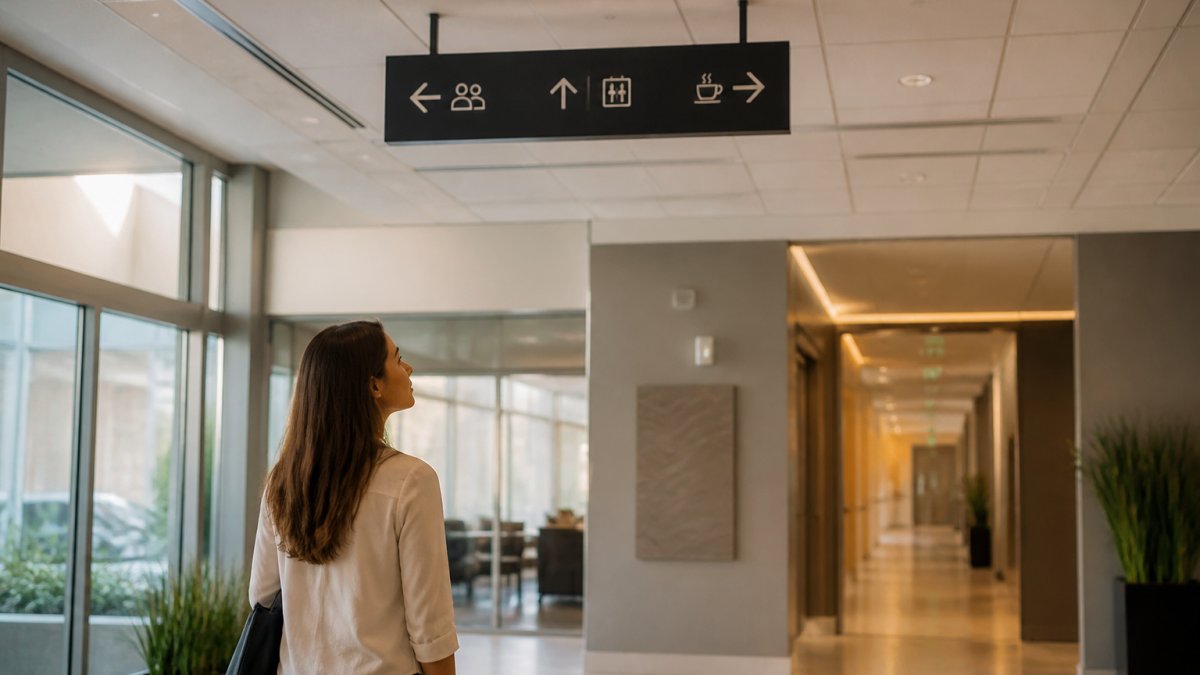
Office wayfinding signs are the directional and identification signs that guide people through a building: floor directories, corridor arrows, room labels, and zone markers. Good wayfinding lets a first-time visitor reach a meeting room unaided.
The Real Cost of Getting Lost in the Office
Every time someone gets lost, three costs land at once. The lost person loses time. The person they ask loses focus. And the interruption ripples outward through the team.
Count the small moments:
- An employee walks two extra minutes to find a conference room
- A visitor waits at reception because no sign marks the check-in desk
- A new hire interrupts a coworker to ask where the supply closet is
None look expensive alone, but multiply them by every employee, every day, and confusion compounds.
Good wayfinding also shapes traffic flow: clear paths stop hallways becoming bottlenecks and keep work zones quiet, since one loud corridor next to a row of desks can wreck focus for an afternoon.
Digital Signage for Employee Communication: When Screens Beat Static Signs
Digital signage for employee communication works best for information that changes often: daily metrics, event schedules, safety reminders, and company news. Static signs win for anything permanent, like room names and directional arrows.
The split is simple: ask how often the message changes.
- Changes weekly or daily: digital screen
- Changes yearly or never: static sign
- Needs to reach everyone at once: digital screen in a high-traffic spot
That rule gets you the hardware decision, not a working system. The part most guides skip is what happens after the screens are mounted.
The Content Governance Problem Nobody Plans For
A digital screen is not a sign but a publishing channel, and publishing channels need an owner, a schedule, and a review cycle. Without those three things, screens decay fast.
A common pattern: a company buys six screens, mounts them in the break room and lobby, and runs a rotating slide deck for three weeks. Then the person who built the deck changes roles, the deck keeps running, and birthdays from last quarter scroll past.
The fix is a lightweight governance model, not a committee:
- Name one content owner. A single person accountable for what runs and when, not a team, not "marketing."
- Set an update cadence. Daily metrics refresh daily, company news weekly, safety content on a defined schedule.
- Define an expiration rule. Every slide gets a kill date; if nobody renews it, it comes down automatically. This one rule prevents most stale-content problems.
- Cap the rotation. Three to five slides per loop, more and people tune out before the important message appears.
- Review quarterly. Walk the screens as you walk the hallways, and take anything outdated down that day.
Digital Versus Static: The Real Trade-Offs
The decision is not "which is better" but "which failure mode can you live with."
| Factor | Digital Signage | Static Signage |
|---|---|---|
| Update speed | Instant, from one dashboard | Requires a reprint or a new panel |
| Upfront cost | Higher, hardware, mounting, power, network | Lower, one-time fabrication |
| Ongoing cost | Content labor, electricity, software or player maintenance | Near zero until the message changes |
| Failure mode | Goes dark, freezes, or fills with stale content | Becomes inaccurate and misdirects people |
| Best for | Metrics, events, rotating announcements, safety campaigns | Room names, directional arrows, permanent wayfinding |
| Worst for | Permanent wayfinding, a dark screen is a dead end | Anything that changes more than once a year |
A hybrid system usually wins: static signs handle the permanent navigation layer, arrows, room labels, and floor directories that must work even when the power is out, while digital screens handle the changing layer of announcements, metrics, and campaigns.
Maintenance and Reliability
Digital screens introduce failure points static signs do not have: power, network connectivity, media players, and software. Plan for them.
- Power: Confirm the mounting location has a reliable circuit. A screen that reboots during a brownout is worse than no screen.
- Network: Confirm Wi-Fi or Ethernet coverage at every screen location before mounting.
- Fallback content: Set the player to display a default slide if it loses connection, a blank screen reads as broken.
Static signs never go stale on their own, but they also never adapt. If your floor plan changes, the old sign sends people the wrong way, so permanent signs should be replaceable without repainting the wall.
Workplace Signage Best Practices: Placement, Readability, and Information Hierarchy
Placement means the sign sits at the exact point where someone chooses a direction. A sign at the far end of a hallway is useless; a sign at the fork is everything.
Readability depends on distance and contrast. A room label read from arm's length needs smaller text than a directory read across a lobby.
Information hierarchy is the part most offices get wrong. Every sign competes for attention, and if everything is bold, nothing is.
| Sign Type | Best Placement | Read Distance | Update Frequency |
|---|---|---|---|
| Directional arrows | Hallway intersections | 3-6 m | Rarely |
| Room labels | Beside each door | 1-2 m | Rarely |
| Floor directories | Elevator lobbies | 2-3 m | Yearly |
| Digital screens | Break rooms, entrances | 2-4 m | Daily to weekly |
| Safety and exit signs | Above doors, along routes | 6-10 m | Never |
Accessibility and Inclusive Wayfinding
Accessible wayfinding serves everyone, not just visitors with disabilities: a person should be able to find their way using more than one sense.
Practical steps include:
- Pair text with icons so signs work for people who read slowly or not at all
- Add tactile or braille elements to permanent room signs (Chapter 7: Signs)
- Avoid relying on color alone to signal meaning (Making Color Usage Accessible)
Get these right and the whole building gets easier to read. Accessibility is not a separate project, it is good wayfinding done properly.
Common Mistakes in Office Signage Design That Hurt Productivity
The most common mistakes in office signage design are inconsistency, clutter, and neglect. Each quietly trains employees to ignore signs altogether.
Here is what we see most often:
- Mixed fonts and styles. Every department orders its own signs, so the building looks assembled from spare parts.
- Too many signs. When every surface carries a message, employees stop reading any of them.
- Signs that outlive their accuracy. A sign pointing to a department that moved two years ago is worse than no sign at all.
- No owner. Nobody is responsible for updates, so the system decays one broken sign at a time.
- Ignoring sightlines. A sign blocked by a plant or a coat rack does nothing.
The fix is rarely more signs, it is fewer, better-placed signs that follow one visual system.
How to Audit and Measure Signage Impact on Productivity
A signage audit is a structured walk-through that maps every sign, checks it against the space, and flags what is missing or misleading. Measuring impact means tracking the friction signs are meant to remove, before and after the change, with a defined window.
Most offices skip the measurement step entirely, refreshing the signs and never checking whether anything improved, a missed opportunity, because signage is one of the few workplace changes you can measure without a research budget.
Step 1: Run the Audit
Run the audit in five steps:
- Map the building. Sketch every floor and mark each decision point where someone must choose a direction, hallway forks, elevator lobbies, stairwell exits, reception entries.
- Inventory every sign. Note its location, condition, and whether the message is still accurate. Photograph anything questionable.
- Test with a stranger. Ask someone unfamiliar with the space to find a specific room. Watch where they hesitate, backtrack, or ask for help. Do not guide them.
- Log the friction. Note every wrong turn, every question asked, every pause longer than a few seconds.
- Rebuild around the gaps. Add signs where people got lost. Remove signs that add noise. Fix anything that points to a space that no longer exists.
Step 2: Pick Your Baseline Metrics
Before you change anything, measure the current state. Pick three to five signals you can track without a research team:
- Wayfinding questions at reception. Have the front desk tally every "where is" question for two weeks, a simple paper log works.
- Time to find a room. Ask a handful of employees to time themselves walking to a common meeting room they do not usually use. Record the range, not just the average.
- Meeting start delays. Note how many meetings start late because someone could not find the room.
Keep the baseline window short; two to four weeks is usually enough to see a pattern.
Step 3: Make the Change, Then Re-Measure
After the signage refresh, wait two to four weeks before re-measuring so people have time to notice the new signs and drop old habits, then run the same metrics with the same method.
Look for direction, not precision. If wayfinding questions drop and wrong turns stop, the signs are working. If nothing changes, the problem was probably not signage, it may be floor plan, staffing, or something else.
Step 4: Separate Signage From Everything Else
Signage is one factor among many workplace conditions. Focus, collaboration, and morale are shaped by lighting, noise, management, workload, and dozens of other variables, so a signage refresh that coincides with a new project deadline will not show clean results.
A few ways to keep the signal clean:
- Change one thing at a time. If you are also rearranging desks or changing meeting room policies, measure signage separately or wait.
- Use a control area if you can. With two floors or wings, refresh signage in one and leave the other alone for the measurement window, then compare.
- Ask employees directly. A short survey question, "How easy is it to find a room you have not visited before?", gives you a perception baseline that complements the hard counts.
Step 5: Set a Review Cadence
Signage decays. People move desks, departments relocate, rooms get renamed. A quarterly walk-through, the same audit from Step 1, run quickly, keeps the system honest.
Conclusion: Getting Office Signage Right for Your Team
The offices that get signage right share one habit: they treat it as a system, not a series of one-off purchases.
If your office has grown faster than its signage, that is exactly the kind of project we handle at GBCJ Los Angeles.
Get started with GBCJ Los Angeles and give your team a workplace where nobody has to ask where the meeting room is.
Frequently Asked Questions
How does office signage affect employee productivity?
Office signage affects productivity by reducing time employees waste searching for rooms, meeting spaces, and colleagues. Clear directional signs and well-placed labels cut interruptions and help people move through the workspace faster. When signage is consistent and easy to read, employees spend less mental energy on navigation and more on their actual work. Digital displays that share updates and schedules also reduce email clutter and keep teams aligned without constant check-ins.
What types of signs are useful in an office?
Useful office signs include directional signs for wayfinding, room and department labels, safety and exit signs, policy reminders, and digital displays for announcements. Collaborative spaces benefit from zone markers that distinguish quiet areas from meeting rooms. Visitor-facing signs help guests navigate without staff escorts. The most effective offices combine static signs for permanent information with digital signage for employee communication that changes regularly, such as event schedules or performance updates.
What are common mistakes in office signage design?
Common mistakes include inconsistent fonts and colors across signs, placing signs too high or too low for comfortable reading, overcrowding signs with too much text, and failing to update outdated information. Another frequent error is designing signs without considering accessibility, such as poor contrast or no Braille options. Signs that blend into the wall or use low-contrast colors also get ignored. Keeping a simple visual hierarchy and auditing signs regularly prevents most of these problems.
Can digital signage improve workplace communication?
Digital signage improves workplace communication by delivering timely updates without relying on email or printed memos. Screens in break rooms or lobbies can show company news, safety reminders, and event schedules. Unlike static signs, digital displays let you change content in minutes, which matters when priorities shift. They also support employee engagement by highlighting recognition and team achievements. The key is keeping content fresh and relevant so employees do not tune it out.