 how-to
How to Improve Storefront Sign Visibility
Table of Contents
- Assess Your Current Visibility with an Audit Checklist
- Optimize Storefront Sign Placement for Maximum Impact
- Choose Storefront Sign Color Contrast That Commands Attention
- Set the Right Storefront Sign Lettering Size for Readability
- Enhance Visibility with Lighting and Illumination
- Use Window Decals for Retail Visibility Without Blocking Views
- Maintain Your Sign for Consistent Impact
- Test, Measure, and Adjust for Results
- Frequently Asked Questions
Last Updated: October 7, 2026
Assess Your Current Visibility with an Audit Checklist
Before you make changes to your storefront sign visibility, you need to know what's actually working. The best way to start is with a simple audit. Walk around your storefront at different times of day. Look at it from a customer's perspective, both from the sidewalk and from the street.
Check these key visibility factors:
- Can you see the sign from 50 feet away?
- Is the sign visible at night, or does it disappear into darkness?
- Does anything block the view, trees, poles, parked cars, or other signs?
- Can pedestrians read it while walking at normal speed?
- Is the sign positioned at eye level, or do people have to look up or down?
- Does the sign stand out from its background, or does it blend in?
- Are there glare issues on sunny days that wash out the lettering?
Document what you find. Take photos from different angles and distances. Note the time of day and lighting conditions. This baseline matters because you'll measure your improvements against it.
The most common visibility problem isn't poor design, it's placement. A sign that's too high, too small, or blocked by obstacles won't work no matter how well it's made. That's where most businesses start losing foot traffic without realizing why.
Optimize Storefront Sign Placement for Maximum Impact
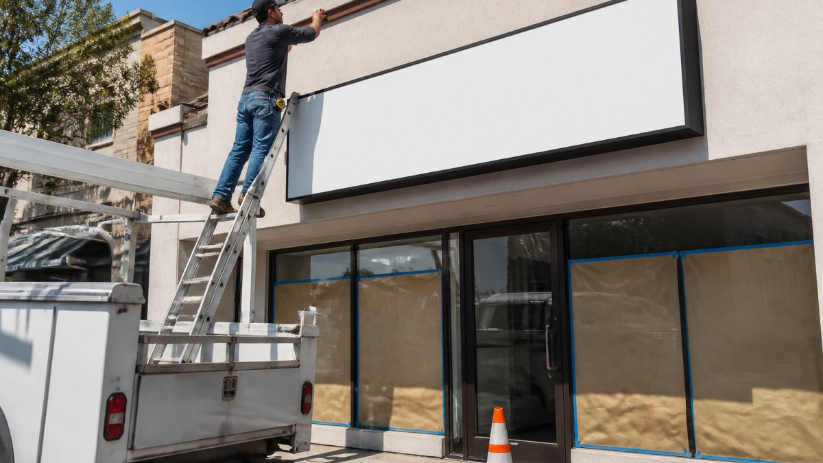
The location of your sign determines whether approaching customers even notice it. Eye-level placement is non-negotiable. Most people scan at eye level, roughly 4.5 to 6 feet from the ground. Signs higher than that get missed.
Position your sign so it's visible from at least two directions: from the street as vehicles approach, and from the sidewalk as pedestrians walk by.

High-traffic areas matter more than you'd think. Place signage near entrance points where customers naturally look. If you have multiple entrances, each one should have clear directional signage. Window displays and entrance markers work together to guide attention.
Avoid common placement mistakes:
- Don't hide the sign behind landscaping or utility boxes
- Don't position it so parked cars block the view
- Don't place it so high that only tall people notice it
- Don't angle it away from approaching foot traffic
- Don't put it where building shadows make it hard to read at certain times
Test your placement by having someone stand across the street and in front of the building. Ask them what they notice first. If your sign isn't mentioned in the first few seconds, reposition it.
Choose Storefront Sign Color Contrast That Commands Attention
Color contrast is the difference between your lettering and the background. High-contrast combinations stop people. Low-contrast combinations blend into the background and disappear.
The best color contrasts for storefront sign visibility are:
- Black lettering on white or yellow background
- White lettering on dark blue, dark green, or black background
- Yellow lettering on dark backgrounds
- Dark lettering on light backgrounds
Avoid these combinations:
- Red on green (colorblind customers can't read it) (Guidance on Web Accessibility and the ADA)
- Light colors on light backgrounds
- Dark colors on dark backgrounds
- Neon colors that vibrate and strain the eye
Test your color choice in different lighting. A sign that looks great under indoor lighting might disappear in sunlight. Bright daylight washes out some colors. Shadows change how colors appear. If you have the option, view your color samples outside in actual sunlight before you commit.
The psychology of color matters too. Warm colors (red, orange, yellow) grab attention quickly. Cool colors (blue, green) feel professional but take longer to register. For retail storefronts, warm colors often win. For professional offices, cool colors build trust.
Contrast also applies to your entire storefront sign visibility strategy. Don't just rely on color. Combine color contrast with size, lighting, and positioning. A high-contrast sign that's too small or poorly positioned still won't work.
Set the Right Storefront Sign Lettering Size for Readability
Letter size determines how far away customers can read your sign. This is called viewing distance. A general rule: people can read letters from a distance of about 10 times the letter height.
The question is: how far away should customers be able to read your sign? If your storefront is set back from the street, you need larger letters. If it's right on the sidewalk, smaller letters work.
Calculate the distance from your sign to the farthest point where you want customers to read it. Divide that by 10. That's your minimum letter height.
For example:
- Street distance of 40 feet = 4-inch letters minimum
- Sidewalk distance of 20 feet = 2-inch letters minimum
- Set-back entrance of 60 feet = 6-inch letters minimum
Stroke width (the thickness of the letters) also affects readability. Thin letters are elegant but harder to read from a distance. Thicker letters are easier to see.
Don't make the mistake of choosing letters that look good at arm's length. Step back 30 feet and see if you can still read them comfortably. If you squint, the letters are too small.
Enhance Visibility with Lighting and Illumination
Lighting transforms your storefront sign visibility. A sign that's invisible at night becomes worthless for evening customers. Proper illumination extends your visibility 24 hours a day.
Two types of lighting work for storefronts:
External lighting shines on the sign from outside. Spotlights or flood lights mounted above or to the side illuminate the sign face. This works well for traditional signs and is relatively affordable. Make sure the light source doesn't create glare that washes out the lettering.
Internal lighting comes from behind or inside the sign. Backlit letters glow and stand out even in darkness. Neon or LED tubes inside letter forms create high impact. This costs more but delivers exceptional visibility at night.
Choose lighting based on your visibility needs. If most of your customers arrive during daylight, external lighting might be enough.
Position lights so they illuminate the entire sign evenly. Shadows on part of the sign reduce readability. Angle lights to minimize glare on the sign face. Test your lighting at night from different distances and angles.
Seasonal and weather conditions affect lighting. Winter days are shorter and darker. Rain and fog reduce visibility. Summer glare can wash out some lighting effects. Plan for the worst-case visibility scenario in your market.
Use Window Decals for Retail Visibility Without Blocking Views
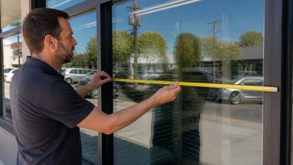
Window decals and graphics are powerful tools for storefront sign visibility. They catch attention while displaying your message. The key is balance, you want visibility without blocking customers' views into your store.
Partial window coverage works best. Cover the top and bottom portions of windows, leaving the middle clear so customers can see inside. This shows what you sell while maintaining storefront appeal.
Decal placement matters:
- Top third: brand name, logo, main message
- Middle third: keep mostly clear for sightlines
- Bottom third: promotions, contact info, hours
Use high-contrast colors on window decals. White or bright colors on window glass are visible from the street. Dark decals on tinted glass disappear. Test your decal colors against the actual window glass before installation.
Window graphics serve double duty. They improve storefront sign visibility from the street while creating an attractive storefront presence. They're also easier to change than permanent signage, so you can update promotions seasonally.
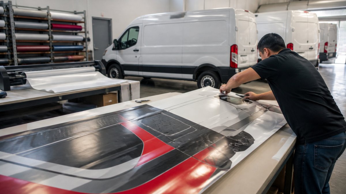
The best window decals are professionally designed and installed. Poor installation, bubbles, wrinkles, misalignment, makes your storefront look unprofessional and reduces visibility impact.
Maintain Your Sign for Consistent Impact
A dirty, faded, or damaged sign destroys your visibility work. Regular maintenance keeps your storefront sign visibility strong over time.
Monthly maintenance checklist:
- Clean the sign face to remove dust, dirt, and grime
- Check for water damage or peeling paint
- Inspect lighting to ensure all bulbs work
- Look for fading or color degradation
- Verify that nothing blocks the view
- Check that the sign is secure and not loose
Seasonal maintenance:
- Spring: deep clean after winter weather
- Summer: check for sun damage and fading
- Fall: clear leaves and debris that block visibility
- Winter: remove snow and ice that cover lettering
Damaged graphics, outdated promotions, and worn lettering signal that your business is struggling. Customers notice. Fresh, well-maintained signage signals professionalism and active business. That builds trust and drives foot traffic.
If your sign shows significant wear, consider a refresh. Faded colors reduce visibility. Cracked or peeling materials look neglected. A new sign or a professional restoration costs less than losing customers to poor visibility.
Test, Measure, and Adjust for Results
Improving storefront sign visibility requires testing. You can't know what works without measuring the results.
Test one variable at a time. If you change the sign placement, color, and lighting simultaneously, you won't know which change actually improved visibility.
Measure these indicators:
- Foot traffic count (how many people enter your store)
- Customer inquiries about your location or hours
- Walk-in customers versus those who called ahead
- Time it takes new customers to find your entrance
Track your baseline before making changes. Count foot traffic for a week. Note how many customers ask for directions.
Weather and seasonal conditions affect results. Don't compare summer foot traffic to winter foot traffic.
Small improvements add up. A 10% increase in foot traffic from better sign visibility is significant. That's real money.
Work with a professional sign partner who understands these principles. At GBCJ Los Angeles, we help businesses improve storefront sign visibility through strategic placement, design, and maintenance.
Improving storefront sign visibility doesn't require guesswork. Start with an audit, optimize placement and contrast, ensure readable lettering size, add proper lighting, and maintain your sign consistently.
The goal isn't a beautiful sign, it's a sign that brings customers through your door. When your storefront sign visibility improves, your foot traffic improves.
Frequently Asked Questions
How large should storefront lettering be to read from the street?
A common rule is one inch of letter height for every 10 feet of viewing distance. If customers approach from 50 feet away, aim for 5-inch letters minimum. For vehicles passing at 25 mph, increase to 8-10 inches. Test your lettering by standing at the farthest point where you want the sign readable, if you strain to read it, the letters are too small. Account for nighttime viewing; illuminated letters can appear smaller than they are.
What color combination makes a storefront sign most visible?
High contrast is critical. Black text on yellow, white on black, or dark blue on white rank among the highest-contrast combinations. Avoid red on green or similar pairs that create visual confusion. Check contrast ratios using accessibility standards, aim for at least 4.5:1 for text readability. Test your color choice under different lighting: midday sun, evening shade, and nighttime with your planned illumination. Colors that pop in daylight may disappear under certain lighting conditions.
How can window decals improve retail visibility without blocking the view inside?
Use perforated vinyl or partial-coverage decals that allow customers to see into your storefront while still conveying your message. Position decals at eye level on the upper or lower portions of windows, leaving the center clear. Decals work best for directional signage, promotions, or branding elements rather than dense text. Apply them to the outside surface to prevent interior glare. Combine decals with interior lighting to create depth and draw attention from the street.
Does storefront sign visibility change in different weather or lighting conditions?
Yes significantly. Glare from midday sun can wash out colors and make some signs harder to read. Overcast days reduce contrast. Rain or fog can obscure distant signs. At night, only illuminated signs remain visible. Test your sign at multiple times of day and in various weather. If your storefront gets afternoon sun glare, consider anti-glare coatings or repositioning. For nighttime visibility, invest in consistent, even illumination, spotlights create shadows that reduce readability. Seasonal changes in sun angle also affect how light hits your sign.