 how-to
How to Design Effective Vehicle Fleet Graphics
Table of Contents
- Why Vehicle Fleet Graphics Matter for Your Business
- Step 1: Define Your Fleet Graphics Goals and Key Message
- Step 2: Establish Brand Consistency Across Your Fleet
- Vehicle Wrap Design Best Practices for Maximum Impact
- Fleet Graphics Design Templates and Vehicle-Specific Constraints
- Full Wrap vs. Partial Wrap for Fleet Vehicles: Making the Right Choice
- Vehicle Graphics Examples and Design Workflow
- Step 3: Prepare Your Artwork and Work with a Professional Designer
- Frequently Asked Questions
Last Updated: October 6, 2026
Why Vehicle Fleet Graphics Matter for Your Business
Your fleet is moving advertising. Every vehicle on the road carries your brand message to thousands of potential customers daily. At GBCJ Los Angeles, we've spent over 15 years helping local businesses transform their vehicles into powerful marketing tools.
A vehicle with professional graphics catches attention. People notice it. They remember it. When your business name, logo, and contact information are clearly visible on your fleet, you're building brand awareness with every mile driven.
Here's what makes fleet graphics different from other advertising:
- Your message reaches people where they live, work, and shop
- The graphics work 24/7, even when your business is closed
- You're not paying per impression like digital ads
- Consistent branding across multiple vehicles reinforces your message
The key to effective vehicle fleet graphics is understanding that design and visibility work together. A beautiful design that's hard to read from a distance won't drive results. A simple design with poor color choices will fade into the background. Your graphics need to balance professionalism with impact.
Step 1: Define Your Fleet Graphics Goals and Key Message
Before you design anything, clarify what you want your graphics to accomplish. Are you building brand awareness? Driving calls to your business? Directing people to your website? Your goal shapes every design decision.
Your key message should be simple. Most people see a moving vehicle for just 5-10 seconds. In that time, they need to understand who you are and why they should care.
Start with these questions:
- What's the one thing you want people to remember about your business?
- What action do you want them to take after seeing your vehicle?
- Who is your target customer?
- What sets your business apart from competitors?
Your key message might be your business name alone. It might be your business name plus a short tagline. It might highlight a specific service or offer.
At GBCJ Los Angeles, we work with clients to distill their message down to what matters most. A plumbing company doesn't need to list every service on their vehicle.
Step 2: Establish Brand Consistency Across Your Fleet
If you have multiple vehicles, they need to look like they belong together. Inconsistent graphics create confusion. Consistent graphics build recognition.
Brand consistency means using the same colors, fonts, logo placement, and design style across every vehicle in your fleet. When someone sees your second vehicle, they should immediately recognize it as yours.
Start by defining your brand standards:
- Logo placement: Where does your logo appear on each vehicle?
- Color palette: Which colors represent your business? Stick to 2-3 primary colors.
- Fonts: Choose 1-2 fonts and use them consistently. Avoid mixing too many typefaces.
- Layout: Where do you place your business name, contact info, and messaging?
- Vehicle coverage: Are all vehicles full wraps, partial wraps, or decals?
Consistency doesn't mean boring. It means professional. A fleet of vehicles with matching graphics looks established and trustworthy. It signals that your business is serious about its brand.
When designing fleet graphics, think about how they'll look from a distance. Drivers passing your vehicle have seconds to absorb your message. Consistent, clear graphics make that message stick.
Vehicle Wrap Design Best Practices for Maximum Impact
Vehicle wraps are the most visible form of fleet graphics. A wrap covers large areas of your vehicle and creates a moving billboard effect. Effective wraps follow specific design principles.
Typography and Legibility from a Distance
Your text needs to be readable from 100 feet away. Most people viewing your vehicle are moving. They're in traffic. They're distracted. Your typography has to work hard.
Font size matters more than you think. Small, delicate fonts disappear on a moving vehicle. Bold, clean fonts command attention.
Here's what works for vehicle graphics:
- Use bold, sans-serif fonts (like Arial, Helvetica, or Gotham)
- Make your business name the largest element
- Keep body text to a minimum, only essential information
- Avoid thin, decorative, or script fonts
- Test readability from at least 50 feet away
Your business name should be large enough to read from a moving car. Contact information (phone number, website) should be clearly visible but slightly smaller. Supporting text should be minimal.
The rule of thumb: if you can't read it from across a parking lot, it's too small.
Color, Contrast, and Visual Hierarchy
Color is your most powerful design tool. The right colors grab attention. Poor color choices make your graphics blend into the background.
High contrast is essential. Your text needs to stand out from your background. Dark text on a light background works. Light text on a dark background works.
Think about visual hierarchy. What's the most important information? Make it biggest and most prominent. What's secondary? Make it smaller and less dominant. What's just supporting detail? Keep it minimal.
Effective color strategies for fleet graphics:
- Use 2-3 colors maximum (including your background)
- Choose colors with high contrast
- Match your brand colors when possible
- Test your design in different lighting conditions
- Bright, bold colors get more attention than muted tones
A white vehicle with black text and a bright accent color (like orange or blue) stands out on the road. A white vehicle with light gray text disappears. The same design principle applies whether your vehicle is white, black, or any other color.
Logo Placement and Image Quality
Your logo is your brand's visual signature. Place it prominently but not so large that it overwhelms other important information.
Logo placement depends on your vehicle type. On a van or truck, your logo might go on the side panel. On a car, it might go on the door. On a large box truck, you have more flexibility.
Image quality matters. A pixelated or blurry logo looks unprofessional. Use high-resolution images (at least 300 DPI for print). If you don't have a high-resolution logo, have one created before you design your graphics.
Photos and illustrations also need to be high-quality. Blurry images or low-resolution photos damage your brand perception. Customers make quick judgments about your business based on how professional your vehicle looks.
Fleet Graphics Design Templates and Vehicle-Specific Constraints
Every vehicle has different dimensions and design challenges. A sedan has different surfaces than a box truck. A delivery van has different proportions than a service vehicle.
Vehicle-specific design constraints include:
- Panel breaks: Most vehicles have natural panel breaks where the design must align
- Curves and angles: Vehicles aren't flat. Your design needs to account for the vehicle's shape
- Window placement: Windows interrupt your design space
- Door handles and trim: These elements create design limitations
- Visibility angles: What looks good head-on might look distorted from the side
Professional designers understand these constraints. They create templates that work with your specific vehicle's dimensions. A design that works perfectly on a Ford Transit might not work on a Sprinter van.
When working with a designer, provide your exact vehicle year, make, and model. This ensures the design fits properly and looks professional when applied.
Templates help maintain consistency across your fleet. If you have multiple vehicles of the same type, the same template can be applied to each one. If you have different vehicle types, you need different templates for each.
Full Wrap vs. Partial Wrap for Fleet Vehicles: Making the Right Choice
Vehicle wraps come in two main styles: full wraps and partial wraps. Each has advantages and trade-offs.
A full wrap covers the entire vehicle with graphics. The entire surface becomes your advertising space. Full wraps create maximum impact and complete brand coverage. They're also the most expensive option.
A partial wrap covers selected areas, typically the sides and back. Partial wraps are more affordable. They still create strong visibility while leaving the vehicle's original color visible.
Which should you choose?
- Full wrap: Best for high-visibility vehicles, premium brands, or maximum advertising impact
- Partial wrap: Best for budget-conscious businesses, vehicles that won't be seen from all angles, or when you want to showcase the vehicle's original color
Consider your budget, your visibility needs, and your brand image. A premium service business might justify a full wrap.
The visibility difference between full and partial wraps is smaller than you might think.
Vehicle Graphics Examples and Design Workflow
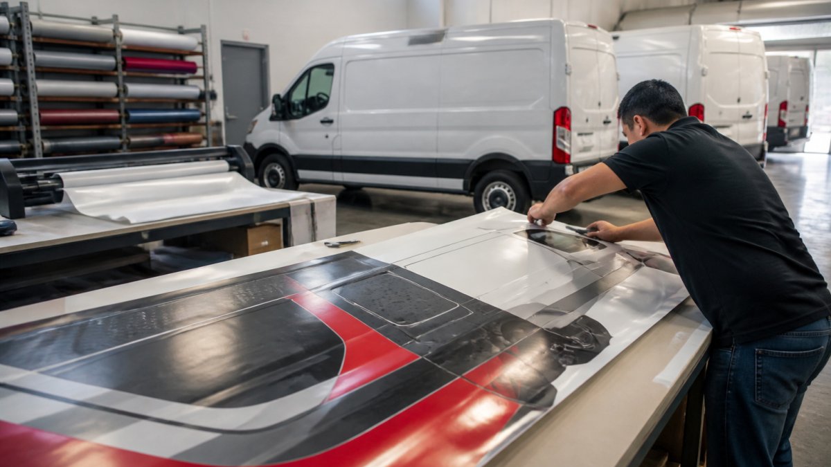
Effective vehicle fleet graphics follow a clear design workflow. This process ensures your final graphics are professional, on-brand, and production-ready.
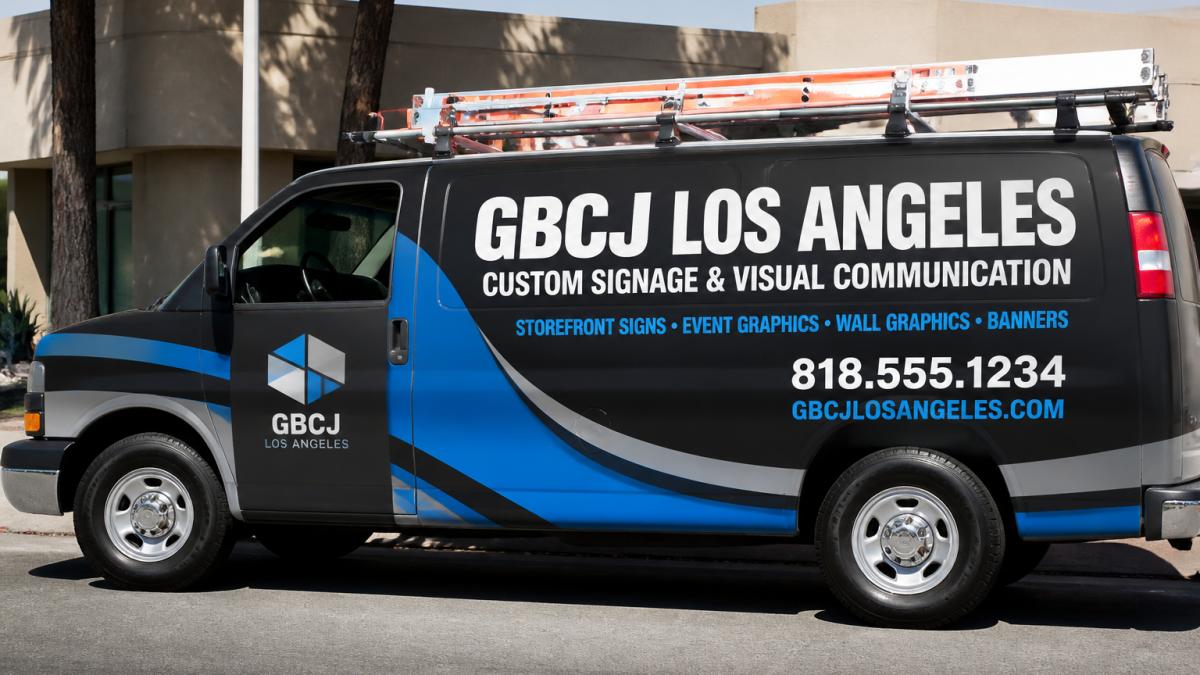
The design workflow typically includes:
- Brief and discovery: You describe your goals, brand, message, and vehicle type
- Concept development: The designer creates initial concepts based on your input
- Feedback and refinement: You review concepts and provide feedback
- Design finalization: The designer refines the selected concept into production-ready artwork
- File preparation: The artwork is prepared for printing and installation
- Proof review: You approve the final design before printing begins
- Production and installation: The graphics are printed and applied to your vehicle
This workflow ensures your final graphics match your vision. It also catches issues before expensive printing happens.
Working with a professional designer matters. They understand vehicle dimensions, printing requirements, and installation considerations.
Step 3: Prepare Your Artwork and Work with a Professional Designer
Once your design is finalized, the artwork needs to be prepared for production.
Artwork preparation includes:
- File format: Your design needs to be in a format that printing equipment can read (usually PDF or specific design software files)
- Resolution: All images must be high-resolution (300 DPI minimum for print)
- Color mode: Files need to be in the correct color mode (CMYK for print, not RGB)
- Bleed: Designs need bleed space (extra area beyond the final edge) to account for cutting and installation
- Font conversion: All fonts must be converted to outlines or embedded to avoid printing errors
- Proofing: A final proof should be reviewed and approved before printing
These technical requirements exist for a reason.
Professional designers handle these details. They know what printing equipment needs.
When you work with a professional, you're not just paying for design. You're paying for expertise.
At GBCJ Los Angeles, our team manages the entire process from concept to installation.
Your vehicle fleet graphics represent your business. They create first impressions. They build brand recognition.
The difference between good graphics and great graphics is often in the details. Clear messaging. High contrast.
When you're ready to transform your fleet into a powerful marketing tool, we're here to help.
Your fleet is constantly moving through your market.
Frequently Asked Questions
What makes vehicle fleet graphics effective?
Effective vehicle fleet graphics combine clear messaging, strong brand consistency, and high visibility. Your business name and contact information must be legible from 50+ feet away. Simple, memorable designs with high-contrast colors ensure drivers and pedestrians notice your vehicles. Professional logo placement and consistent branding across all fleet vehicles reinforce recognition and build trust. The design should communicate your core value in seconds, viewers won't study your vehicle for long.
Should I use a full wrap or partial wrap for my fleet vehicles?
Full wraps provide maximum brand coverage and impact, wrapping the entire vehicle surface for a bold, professional appearance. Partial wraps cost less and work well for smaller fleets or tight budgets, typically covering doors and side panels where they're most visible. Choose full wraps if brand visibility is your priority and budget allows. Partial wraps suit businesses wanting professional branding without maximum expense. Consider your vehicle type, coverage goals, and how vehicles are typically viewed in your service area.
What information should I include on fleet graphics?
Include your business name prominently, a clear logo, phone number, and website. Add a brief tagline or service description if space allows, this helps viewers understand what you do instantly. Contact information should be large enough to read from a moving vehicle. Avoid cluttering the design with too much text. Focus on the essentials: who you are, what you do, and how to reach you. This hierarchy ensures your message gets across in the few seconds a potential customer sees your vehicle.
How do I keep branding consistent across my entire fleet?
Create a fleet graphics style guide documenting your logo, color palette, approved fonts, and layout standards. Apply the same design template to each vehicle, adjusting only for vehicle shape and size. Consistent colors, fonts, and messaging across all vehicles strengthen brand recognition and create a professional, unified appearance. When drivers and customers see multiple branded vehicles, the repetition builds trust and recall. Work with a professional designer to develop templates that adapt to different vehicle types while maintaining visual consistency.