 how-to
How to Increase Retail Foot Traffic With Signs (2026 Guide)
Table of Contents
- Why Signs Are Your Most Underrated Tool for Retail Foot Traffic
- Effective Storefront Signage Design: What Makes People Stop and Walk In
- Types of Outdoor Retail Signs That Drive Foot Traffic
- How to Design Window Decals for Maximum Retail Visibility
- Signage Placement and Wayfinding: Guiding Customers From Sidewalk to Sale
- Digital vs. Physical Signage: Integrating Both for Retail Foot Traffic
- Signage Compliance and Local Zoning: What Retailers Need to Know
- How to Measure Whether Your Signs Are Increasing Retail Foot Traffic
- Frequently Asked Questions
Last Updated: September 19, 2026
Why Signs Are Your Most Underrated Tool for Retail Foot Traffic
Most retailers spend their marketing budget on ads and social posts, then wonder why nobody walks through the door. The sign above that door is often the last thing they think about, even though it is the first thing every potential customer sees. Increasing retail foot traffic with signs starts with a mindset shift: your storefront is your hardest-working salesperson, not decoration.
Effective Storefront Signage Design: What Makes People Stop and Walk In
Good storefront signage design comes down to three things: you must be seen from a distance, understood in a glance, and trusted in a second. If a shopper has to squint or think, they keep walking. The difference between a noticed sign and an ignored one comes down to measurable mechanics, viewing distance, letter height, contrast ratio, and color meaning.

The Legibility Math Most Retailers Never Run
Sign legibility follows a predictable relationship between letter height and viewing distance: roughly one inch of capital letter height per 10 feet of viewing distance for comfortable reading, and one inch per 30 feet for maximum legibility under good conditions. A sign read from 100 feet away needs capital letters around 10 inches tall, before you account for a moving viewer, glare, or a cluttered background.
Run the math for your own storefront:
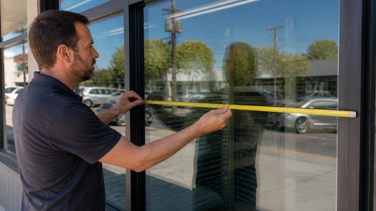
- Measure the sightline. Stand where the average shopper first sees your store, often a crosswalk, a parking lot entrance, or a stop sign, and pace off the distance.
- Divide by 10 for comfortable reading. A 60-foot sightline calls for roughly 6-inch capital letters.
- Add 20-30% for motion or glare. Drivers and shoppers in bright sun need bigger type than pedestrians on a shaded sidewalk.
- Check the secondary sightline. Your sign also has to work from directly across the street, which is usually a shorter distance and a different angle.
Color Psychology and Contrast: What Actually Moves Shoppers
Color choices do real work, but not the way most articles suggest. Color meaning is largely learned and contextual, while contrast drives whether a sign is noticed at all. A red sign on a red brick wall disappears; on cream stucco it stops traffic.
- Red and orange tend to read as urgency, appetite, and action. They are common in food service and clearance messaging for that reason.
- Blue tends to read as trust, reliability, and calm. It is overrepresented in banking, healthcare, and professional services.
- Green tends to read as freshness, health, and value, useful for grocery, wellness, and eco-positioned brands.
- Yellow and black combinations produce some of the highest-contrast pairings available and are common in warning and discount signage for that reason.
- White space is a color choice too. Crowding a sign with color reduces the contrast that makes any single element pop.
The Design Rules That Survive Contact With the Street
Here is what separates signs that work from signs that get ignored:
- Contrast beats color. Dark text on a light background (or the reverse) reads fastest.
- Fewer words, bigger type. Three to five words is the storefront sweet spot.
- One clear message. Pick a name, a category, or an offer, not all three.
- Consistent branding. The sign, window, and door should feel like one store.
- Test in context. A design that looks sharp on a monitor can lose to a plain sign that wins on the wall.
Types of Outdoor Retail Signs That Drive Foot Traffic
The right outdoor retail signs depend on your location, budget, and how people move past your store. A sidewalk-facing cafe needs different signage than a strip mall anchor store:
| Sign Type | Best For | Key Consideration |
|---|---|---|
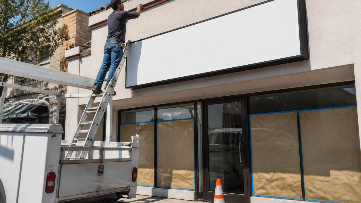
| Storefront sign | Every retail location | Sized to be read from the street |
| A-frame / sidewalk sign | Walkable districts | Check local rules on sidewalk use |
| Window decals | Street-facing windows | Keep 20-30% of glass clear |
| Banners | Promotions and events | Replace often to stay fresh |
| Vehicle graphics | Mobile brand reach | Best for service fleets |
Sidewalk Signs, Banners, and A-Frames: What Actually Works
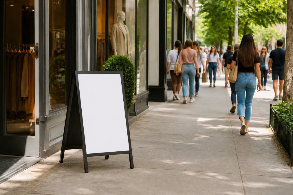
Sidewalk signs and A-frames work because they meet people where they already are, at eye level and on the path. They are cheap to change and easy to test, but many cities limit how far a sign can sit from your door or ban them on certain streets. Banners work best for a specific reason, like a grand opening or a seasonal sale, a banner that never changes becomes wallpaper.
How to Design Window Decals for Maximum Retail Visibility
Window decals are the most underused tool in retail signage. They turn dead glass into a second storefront. Done right, they pull people in. Done wrong, they make your store look closed.
- Keep 20-30% of the window clear. Shoppers need to see inside.
- Put key messaging at eye level. Not at the top, not at the floor.
- Use frosted or perforated film for privacy. Great for offices and salons.
- Repeat your hours and phone number. People read windows while they wait.
- Match your storefront sign. Same fonts, same colors.
Signage Placement and Wayfinding: Guiding Customers From Sidewalk to Sale
Placement decides whether a sign gets seen. Most stores put their sign where it looks good, not where shoppers actually look, often different spots. Think of signage as a path:
- From down the block: the storefront sign catches the eye.
- At the sidewalk: window decals and A-frames confirm what you sell.
- At the door: door decals and hours remove hesitation.
- Inside: aisle signs and shelf tags guide them to the sale.
Digital vs. Physical Signage: Integrating Both for Retail Foot Traffic
Digital signage is not a replacement for physical signs. It is a companion. The best-performing stores use both, and each does a job the other cannot. Physical signs handle permanence: your name, your brand, your location, working 24/7 with no power or updates. Digital screens handle change: daily specials, event countdowns, rotating menus.
A simple way to split the work:
- Physical signs: storefront name, window decals, wayfinding, vehicle graphics.
- Digital screens: promotions, menus, seasonal messaging, live offers.
Signage Compliance and Local Zoning: What Retailers Need to Know
Signage compliance is where most new store owners get surprised. Cities regulate sign size, height, placement, lighting, and even color in some historic districts. Ignore the rules and you may be forced to remove a sign you just paid for.
- Maximum sign area allowed for your zoning type
- Height and setback rules from the property line
- Permit requirements and inspection steps
- Rules for illuminated, digital, or projecting signs
- Landlord approval for shopping center tenants
How to Measure Whether Your Signs Are Increasing Retail Foot Traffic
You cannot improve what you do not track. Measuring signage impact does not require expensive tools, just consistency, a baseline, and a way to connect a walk-in to the sign that brought them in. Most retailers stop at the door counter. The stores that learn from their signage close the loop between the sign, the shopper, and the sale.
Start With the Basics: Count, Baseline, Change One Thing
A simple measurement plan:
- Door counter. Track daily walk-ins with a manual clicker or a basic sensor. Even a $30 clicker used consistently beats a fancy system used sporadically.
- Baseline week. Record traffic for one week before any sign change.
- One change at a time. Swap the sign, then track the next two weeks.
- Compare like days. Weekends and weekdays behave differently. Compare Tuesday to Tuesday, not Tuesday to Saturday.
- Note the weather and local events. A rainy week will tank walk-ins regardless of your sign. Log it so you do not misread the data.
If walk-ins climb after a sign change and nothing else moved, the sign did the work. If they do not, the design or placement needs another look.
Closing the Attribution Loop: Tying Walk-Ins to Specific Signs
This step turns signage from a guess into a managed channel. You have three practical ways to attribute a walk-in to a sign, and they stack.
Reading the Numbers Without Fooling Yourself
A few traps catch almost every retailer running a signage test:
- Seasonality. A sign installed the week before a holiday will look like a winner. Compare against the same week last year if you have it.
- Novelty effect. New signs draw attention for the first week or two regardless of quality. Judge on weeks three and four, not week one.
- Confirmation bias. If you paid for the sign, you want it to work. Decide in advance what result counts as a failure.
- Small samples. A store getting 20 walk-ins a day needs more than a few days of data. Two full weeks is a reasonable minimum.
What Good Looks Like
A realistic goal is not a dramatic spike. Most practitioners find a well-designed, well-placed sign change produces a modest but durable lift in walk-ins, often single-digit to low-double-digit percentages over a baseline, and the bigger win is the compounding effect of fixing multiple weak signs over a year. The point is not to prove one sign was brilliant, but to build a habit of testing so every sign you buy next is a little better than the last.
Frequently Asked Questions
How can I increase foot traffic in my retail store using signs?
Focus on three things: visibility from the street, clear messaging at eye level, and consistent branding across every sign type. A storefront sign that is legible from 30 meters away pulls people in. Window decals that highlight promotions or new arrivals give passersby a reason to stop. Sidewalk signs and A-frames extend your reach onto the pavement. Combine these with seasonal updates and track which changes correlate with higher visitor counts so you know what works.
What makes a retail sign effective at driving foot traffic?
Effective retail signs share four traits: high contrast between text and background, legibility from the distance most people approach, a clear message that answers 'what is this place and why should I walk in,' and proper placement at eye level. Signs that use too many fonts, low-contrast colors, or cluttered messaging get ignored. Simplicity and readability consistently outperform decorative designs when the goal is getting people through the door.
How can I use window decals to attract more customers?
Window decals work best when they cover no more than about a third of your glass so the interior stays visible. Use them to highlight a specific offer, new product, or seasonal promotion rather than listing everything you sell. Place the most important message at eye level, roughly 1.5 to 1.7 meters from the ground. Matte or perforated vinyl reduces glare and keeps the store looking open and inviting rather than dark or closed off.
Do sidewalk signs actually increase store visits?
Sidewalk signs increase store visits when they are placed where pedestrians already walk, kept clean and upright, and carry a message that changes regularly. A static sign that says the same thing for months becomes invisible to repeat foot traffic. Rotating promotions, daily specials, or event announcements give people a reason to look each time they pass. Check local rules first, since many municipalities regulate the size and placement of sidewalk signs.