 how-to
Designing Impactful Signage for Small Retail
Table of Contents
- Why Impactful Signage Drives Foot Traffic and Sales
- Retail Signage Design Best Practices That Convert
- How to Design Window Decals for Maximum Retail Visibility
- Signage Design Tools for Small Business Owners
- ADA Compliance for Retail Signage: What You Must Know
- Digital vs. Static Signage: Which Fits Your Budget?
- DIY vs. Professional Production: Making the Right Call
- Seasonal Signage Rotation Strategy for Year-Round Impact
- Frequently Asked Questions
Last Updated: September 14, 2026
Why Impactful Signage Drives Foot Traffic and Sales
Impactful signage means designing storefront and in-store graphics that stop pedestrians, communicate your offer in seconds, and convert passing traffic into paying customers. At GBCJ Los Angeles, we help small retailers turn a quiet storefront into a destination by fixing what the sign says and where it sits.
A shopper decides keep-or-skip in roughly three seconds, mostly before reading a word (Remembering first impressions). Color, contrast, and size do the heavy lifting; text closes the deal second.
Designing impactful signage for small retail rewards discipline over decoration: every element earns attention or wastes it.
Retail Signage Design Best Practices That Convert
Retail signage design best practices come down to one principle: make the most important message the most visible element. Your window is a display, your sign is the headline, and the customer journey starts on the sidewalk.
Visual Hierarchy and Readability at a Glance
Visual hierarchy is the deliberate ranking of elements so the eye lands on the most important message first. Get this wrong and shoppers read your least important information first, or nothing at all.
Build the hierarchy in three layers:
- Primary: The single thing you want seen from across the street (your name or your core offer)
- Secondary: Supporting detail that rewards a closer look (hours, a promotion, a category)
- Tertiary: Fine print nobody needs from a moving car
Readability follows hierarchy. High-contrast text, generous spacing, and clean letterforms keep the message legible at distance and at speed.
Typography, Color, and Brand Consistency
Typography and color are functional tools that determine legibility and recognition, not aesthetic choices.
A few rules that hold up in practice:
- Limit yourself to two typefaces: one for the brand name, one for everything else
- Use high-contrast color pairings; low-contrast looks elegant in a design file and disappears on glass
- Keep your color palette consistent across every sign, decal, and vehicle graphic so customers recognize you before they read you
- Match promotional messaging to your brand identity rather than chasing whatever color is trending
Brand consistency compounds: by the tenth pass, recognition does the work your copy used to.
How to Design Window Decals for Maximum Retail Visibility
Window decals are the highest-use signage most small retailers underuse. A well-planned decal turns a reflective pane of glass into a salesperson that never takes a break.

Placement, Size, and Eye-Level Positioning
Placement decides whether a decal gets read or ignored. The common mistake is treating the window as a canvas to fill rather than a message to prioritize.
- Eye-level is prime real estate. Put your most important message where a standing adult naturally looks.
- Respect the door swing and sightlines. Never cover the handle, the lock, or the view of your merchandise.
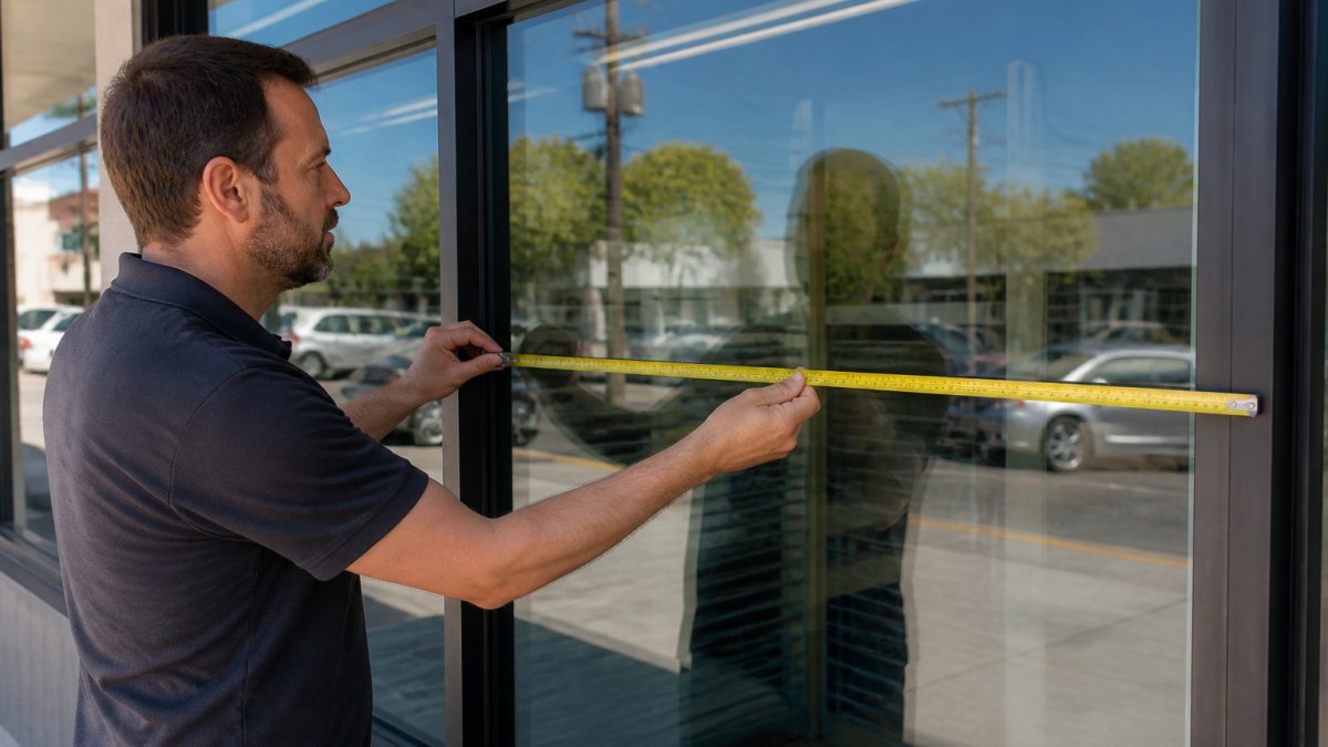
- Size for distance, not for the pane. A decal that looks good in a mockup often reads as noise from thirty feet away.
- Leave breathing room. Crowded windows read as cluttered stores, which suppresses walk-ins.
- Repeat the essentials. Hours, phone number, and a clear call-to-action belong on glass where people pause.
Signage Design Tools for Small Business Owners
Signage design tools for small business fall into three tiers, depending on how much control you want and how often you'll update graphics.
- Template-based online editors: Fast and cheap, best for one-off decals and simple layouts. Limited control over bleed, resolution, and print-ready files.
- Vector design software: Full control over typography, spacing, and scalable artwork. Requires a learning curve and a working knowledge of print specifications.
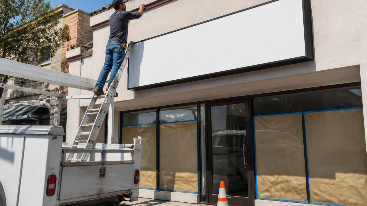
- Professional fabrication partners: You supply the brand direction, they handle layout, materials, permits, and installation. Best when the sign is permanent or code-sensitive.
For most small retailers: use a template tool for temporary promotions and hand anything permanent to a fabricator. Vector files you can't prepare correctly cost more to fix than they save.
ADA Compliance for Retail Signage: What You Must Know
ADA compliance for retail signage is a legal requirement under the Americans with Disabilities Act, enforced through the 2010 ADA Standards for Accessible Design. Most small retailers never read it until an inspector or complaint forces the issue. Storefront rules fall into two buckets: signs that must be tactile and include braille, and signs that must meet visual contrast and character-proportion rules.
Which Signs Trigger Tactile and Braille Requirements
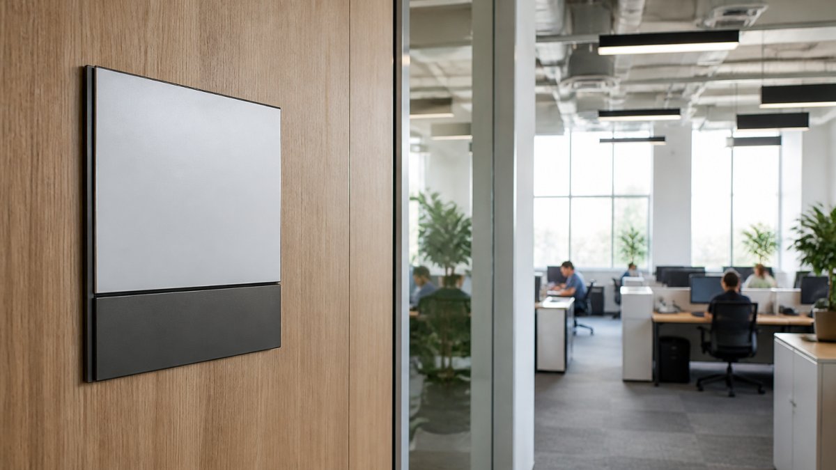
The trigger is the sign's function, not your store's size. Under the 2010 Standards, permanent room identification signs must be tactile and include braille when they identify an accessible room or space (2010 ADA Standards for Accessible Design). In retail that typically means:
- Restroom signs
- Fitting room and dressing room signs
- Office, stockroom, or employee-only door signs
- Any permanent sign identifying a room by name or number
Purely directional or informational signs, a hanging "Sale" banner, a floor decal pointing to a register, a promotional poster, generally need not be tactile, though they still need to meet visual contrast rules if they convey information.
The Numbers That Get Inspected
These are the specs most commonly cited during an ADA review of retail signage. Confirm current values against the ADA Standards for Accessible Design before production, because they are enforced as written.
- Mounting height for tactile signs: the baseline of the tactile characters must be between 48 inches and 60 inches above the finished floor, measured to the baseline of the lowest character.
- Braille placement: contracted braille is required, positioned directly below the corresponding text. Dome-shaped braille is not compliant.
- Tactile character type: raised characters must be sans-serif, uppercase, and between 5/8 inch and 2 inches tall.
- Visual contrast: characters and their background must have a contrast ratio of at least 70 percent. A common failure is dark text on a dark wood-grain plaque that looked elegant in the design file.
- Finish: signs must have a non-glare finish so they remain readable under store lighting.
- Pictograms: if you use a restroom pictogram, it must be on a contrasting field and at least 6 inches tall.
Where Small Retailers Actually Get Tripped Up
The most common pattern: a retailer orders a custom restroom sign with script lettering and no braille, installs it at eye level, and passes inspection for years, until a renovation triggers a review. Re-fabricating one non-compliant sign is inexpensive; re-fabricating a full set after inspection is not.
A second trap is mounting height. Designers often center a sign visually on a door, which can push the tactile baseline above 60 inches. The rule measures to the baseline of the lowest character, not the sign's center.
A Practical Compliance Workflow
- Inventory every permanent sign in customer-facing and employee-accessible areas.
- Flag any sign that identifies a room or space, those are your tactile and braille candidates.
- Verify mounting height, character size, contrast ratio, and finish against the current Standards.
- Have your fabricator certify the specs in writing before production.
- Photograph installed signs with a tape measure in frame for your records.
Designing impactful signage for small retail means designing it legally. A compliant sign isn't a compromise on design, it's a constraint that, handled early, costs nothing extra to meet.
Digital vs. Static Signage: Which Fits Your Budget?
Digital signage wins on flexibility; static signage wins on cost and reliability. The right choice depends on how often your message changes and whether that frequency justifies the ongoing cost of power, hardware, and software. Most small retailers default to static because the upfront math is simpler, but the decision should hinge on how many times per year you actually change the message.
The Real Cost Structure
Static signage has a front-loaded cost and near-zero ongoing cost: you pay once for design, fabrication, and installation, and a window decal or storefront sign typically lasts years with minimal maintenance.
Digital signage inverts that. Upfront you cover a display, media player, mounting, and often wiring and a power drop; then you pay monthly or annually for content software, plus electricity and labor to update content. If the screen fails, you replace hardware, not vinyl.
The break-even question isn't "which is cheaper", it's "how many content changes per year does this sign need before digital pays for itself?" A retailer changing a window promotion four times a year will almost never justify digital on cost alone; a daily menu board is a different case.
| Factor | Static Signage | Digital Signage |
|---|---|---|
| Upfront cost | Lower | Higher |
| Content changes | Reprint each time | Update instantly |
| Power and tech needs | None | Wiring, player, software |
| Ongoing cost | Minimal | Software subscription, electricity, hardware refresh |
| Best for | Fixed brand, hours, seasonal overlays | Rotating promos, menus, multi-location sync |
| Maintenance | Occasional cleaning, replace faded material | Firmware updates, screen replacement, content management |
| Failure mode | Fades or peels slowly | Goes black without warning |
When Digital Actually Pays Off
Digital signage earns its keep in a narrow set of small-retail scenarios:
- Menu boards where items and prices change frequently and reprinting is a recurring cost.
- Multi-location retailers who need to push the same promotion to several stores at once.
- High-traffic windows where a moving image stops more pedestrians than a static decal, motion is the one thing static signage cannot replicate.
- Service businesses with appointment availability, wait times, or rotating service menus.
Outside those cases, a well-designed static sign almost always delivers a better return per dollar for a small retailer.
The Hybrid Approach Most Small Retailers Should Consider
The strongest budget play is rarely all-digital or all-static. It's a permanent static brand sign, the anchor that never changes, paired with a small digital display for the one message that actually rotates, keeping your brand identity fixed and your promotional layer flexible without committing your whole signage budget to hardware and software.
What to Ask Before You Commit
- Does the space have power where the screen will mount, or will you pay for a new circuit?
- Who updates the content, and how long does each update take?
- What happens when the software subscription lapses, does the screen go dark?
- What is the replacement cost if the display fails outside warranty?
Answer those four questions honestly and the static-versus-digital decision usually makes itself.
DIY vs. Professional Production: Making the Right Call
DIY production makes sense for temporary, low-stakes graphics; professional production makes sense for anything a customer sees every day.
A common mistake is DIY-ing a permanent storefront sign to save money, then paying twice when the material fades, the vinyl lifts, or the layout fails at distance. Vehicle graphics are the clearest example: a wrap that isn't prepped and installed correctly starts peeling, a cost you eat twice.
If you're weighing the trade-off, use this quick filter:
- DIY: short-term promotions, interior posters, prototypes
- Professional: storefront signs, window decals, vehicle graphics, anything permanent or code-sensitive
- Hybrid: design it yourself, have a fabricator produce and install it
GBCJ Los Angeles has spent over 15 years producing storefront signs, vehicle graphics, and event displays.
Seasonal Signage Rotation Strategy for Year-Round Impact
Seasonal rotation keeps a storefront from going stale. Retailers who do it well plan the calendar once and rotate on a schedule instead of scrambling before each holiday.
A simple rotation framework:
- Anchor signs: permanent brand signage that never changes
- Seasonal overlays: window decals and banners tied to holidays, back-to-school, or local events
- Promotional layers: short-run sale messaging that swaps monthly
- Refresh cadence: review and rotate overlays each season, and replace anything sun-faded
The goal is visual impact without visual chaos. Rotate the message, keep the brand identity constant.
Small retailers face a real constraint: limited budget, limited time, and a storefront that has to work every day. Designing impactful signage for small retail isn't about spending the most; it's about putting the right message in the right place at the right size. GBCJ Los Angeles builds storefront signs, window decals, and vehicle graphics for businesses that need signage to earn its keep, backed by over 15 years of production experience and a customer-first process that starts with listening. Contact Us to get started with GBCJ Los Angeles and turn your storefront into your hardest-working salesperson.
Frequently Asked Questions
What are the most common signage mistakes small businesses make?
The biggest mistakes are overcrowding signs with too much text, using low-contrast colors that fail legibility tests, and placing key messages below eye level. Many small retailers also skip ADA compliance for retail signage, which can create legal exposure. Another frequent error is treating signage as a one-time purchase instead of refreshing it seasonally. Keep messages short, use high-contrast color pairs, and place the most important content at eye level for maximum readability.
How does signage design influence customer purchasing behavior?
Signage shapes the customer journey before a shopper ever walks through your door. Clear directional signage reduces confusion, while persuasive design at the point-of-purchase triggers impulse buying. High-contrast promotional messaging placed at eye level increases dwell time and conversion rate. Consistent brand identity across storefront, interior, and window decals builds trust that carries into purchase decisions. When signage placement matches foot traffic flow, customers move through your store more deliberately and engage with more products.
Do I need ADA-compliant signage for my small retail store?
Yes, if your store has permanent rooms or spaces, the ADA requires compliant signage for those areas. This includes raised characters, Braille, and specific mounting heights for permanent room signs like restrooms and fitting rooms. Non-compliant signage can result in complaints and potential fines. Work with a signage fabricator who understands ADA compliance for retail signage to ensure your permanent signs meet federal standards. Temporary promotional signs and window decals typically fall outside these requirements.
What design tools can a small business use to create signage without hiring a designer?
Small business owners can start with accessible tools like Canva, Adobe Express, or Visme, which offer sign templates sized for common formats. For more control over typography and vector output, Affinity Designer is a one-time purchase option. These signage design tools for small business work best for window decals and simple interior signs. For storefront signs, vehicle graphics, or anything requiring fabrication, a professional partner ensures print-ready files, correct color matching, and durable materials that hold up outdoors.