 listicle
Common Mistakes in Office Signage Design
Table of Contents
- Poor Readability and Font Choice
- Incorrect Signage Placement and Positioning
- Ignoring ADA Compliance and Accessibility
- Poor Color Contrast and Schemes
- Overloading Information and Visual Clutter
- Office Signage Design Best Practices for Success
- Maintenance and Lifecycle Planning for Signage
- Conclusion
- Frequently Asked Questions
Last Updated: September 3, 2026
Poor Readability and Font Choice
The most common mistake in office signage design is choosing fonts that look good in design software but fail in real-world viewing conditions. Poor font choices create friction, decorative typefaces may feel on-brand, but if viewers struggle to parse letters, they'll move on.
Legibility depends on several factors. Font weight matters significantly; thin typefaces disappear against white backgrounds or in poor lighting. Sans-serif typefaces typically perform better for signage because their clean lines remain distinct at distance. Letter spacing is equally critical; cramped text becomes a visual blur, while generous spacing improves comprehension.
Consider your viewing distance when selecting type size. The general rule: for every 10 feet of viewing distance, use at least 1 inch of letter height. Contrast between text and background is inseparable from font choice, pair dark text on light backgrounds or light text on dark backgrounds, avoiding low-contrast combinations that force viewers to squint.
At GBCJ Los Angeles, we've observed that original designs can look impressive on screen but fail to communicate effectively once installed. Test your font choices at the actual viewing distances and lighting conditions where the sign will live.
Incorrect Signage Placement and Positioning
Where you place a sign matters as much as what the sign says. Poor placement creates wayfinding failures that confuse visitors and frustrate employees.
The biggest placement mistake is positioning signs too high or too low. Most adults read signage at approximately 5 to 6 feet high, though this varies by context. Directional signage placed above doorways works well for wayfinding, but informational signage should be positioned where the viewer's natural sightline encounters it without searching.
Obstructions kill sign effectiveness. A well-designed sign hidden behind a pillar, plant, or furniture becomes invisible. Walk your office space and identify sightlines from common vantage points. Your reception area sign should be visible the moment someone enters.
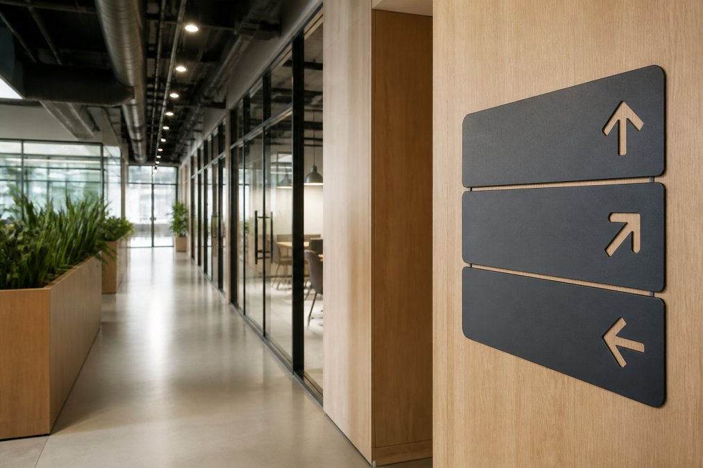
Mounting height and angle affect readability. Signage mounted at 90 degrees to the wall works well for directional signs, but angled mounting can improve visibility in narrow hallways. Distance between signage matters too, clustered signs create visual noise and cognitive overload. Space your directional markers strategically to guide navigation without competing for attention.
The placement strategy changes based on sign type. Wayfinding signage belongs at decision points where someone needs to choose a direction. Identification signage should be positioned consistently so visitors develop a mental map. Informational signage works best when placed near relevant spaces.
Ignoring ADA Compliance and Accessibility
Office signage design that ignores accessibility standards creates legal and practical problems. The Americans with Disabilities Act (ADA) establishes specific requirements for signage in commercial spaces, and offices fall under these regulations.
ADA signage requirements cover multiple dimensions. Character height must be proportional to viewing distance, minimum 1.25 inches for signs viewed from 40 feet away (ada.gov). Text must have contrast ratios of at least 3:1 between characters and background (ada.gov). Raised characters (tactile lettering) are required for room identification and directional markers, enabling users who are blind or have low vision to read by touch.
Braille requirements apply to permanent room and space identification. Any sign identifying a room, office, or permanent space must include Grade 2 Braille positioned directly below or adjacent to the raised characters. This is a legal requirement that many business owners overlook.
Symbol usage matters for accessibility. The International Symbol of Accessibility (wheelchair symbol) must appear on signs identifying accessible entrances, parking, and facilities. Font selection connects directly to accessibility compliance, sans-serif typefaces with consistent stroke width are more accessible than decorative or serif fonts. Avoid all-caps text for long passages; mixed case improves readability for people with dyslexia and low vision.
Color contrast requirements seem straightforward but trip up many designers. Black text on white background provides maximum contrast, but other combinations work if they meet the 3:1 minimum. Avoid color combinations that rely on hue alone, such as red and green, which create insufficient contrast for people with color blindness.
An accessibility audit should be part of your office signage design process. If you're uncertain about compliance, consult the ADA Standards for Accessible Design or work with a signage partner experienced in compliance requirements.
Poor Color Contrast and Schemes
Color is the first thing viewers notice about signage, but poor color choices undermine readability and create visual hierarchy problems that confuse navigation.
The contrast mistake is universal: designers choose colors they like instead of colors that maximize legibility. A navy blue background with dark gray text looks sophisticated in a mockup but becomes illegible in office lighting. Contrast ratios are measurable. The Web Content Accessibility Guidelines (WCAG) define minimum contrast standards: 4.5:1 for normal text, 3:1 for large text. Use a contrast checker tool to verify your color combinations before fabrication. Dark text on light backgrounds consistently outperforms light text on dark backgrounds.
Color psychology influences perception but shouldn't override legibility. Warm colors (red, orange, yellow) grab attention, making them useful for emergency signage. Cool colors (blue, green) feel calming, working well for wayfinding. Neutral backgrounds (white, gray, beige) provide maximum contrast for text and reduce visual fatigue.
Consistency in color schemes creates visual hierarchy and improves wayfinding. If all directional signage uses the same color palette, visitors quickly learn what to expect. Avoid color combinations that create problems for people with color blindness, approximately 8% of men and 0.5% of women experience some form of color vision deficiency. If color is your only distinction between sign types, add symbols, text labels, or patterns to communicate meaning beyond color alone.
Lighting conditions change how colors appear. Test color choices under actual conditions. Matte finishes reduce glare better than glossy surfaces, improving visibility in bright spaces.
Overloading Information and Visual Clutter
Too much information on a single sign creates cognitive overload that defeats the purpose of signage. Viewers have seconds to absorb a message; overloaded signs waste those seconds.
Hierarchy determines what viewers read first. If all text is the same size and weight, nothing stands out. Primary information (room number, department name) should be larger and bolder than secondary details. Use visual hierarchy deliberately, size, color, weight, and position guide viewers through information in order of importance.
Simplicity improves retention. A sign that communicates one clear message is more effective than a sign attempting to convey three ideas. If you need to communicate multiple pieces of information, consider whether separate, focused signs would work better.
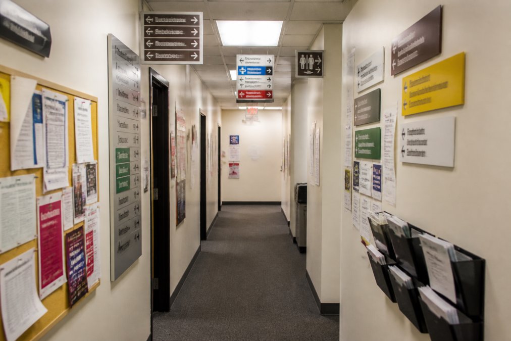
White space isn't wasted space, it's essential design. Margins around text and intentional empty space make signs easier to scan and read. The "three-second rule" guides effective signage design: if someone can't understand the core message within three seconds of viewing, the sign needs simplification.
Symbols and icons can reduce text if they're universally understood. A wheelchair symbol communicates accessibility instantly. A phone icon signals contact information. Avoid symbols that require explanation.
Office Signage Design Best Practices for Success
Effective office signage design follows principles that balance aesthetics with function. Start with a comprehensive audit of your current space. Identify wayfinding pain points where visitors struggle to navigate. Walk through your office as a first-time visitor and document your experience.
Develop a signage system rather than designing individual signs in isolation. A system includes consistent typography, color palettes, materials, and mounting standards. Consistency creates visual coherence and helps viewers develop mental maps of your space.
Typography deserves careful attention. Select typefaces that prioritize legibility over novelty. Sans-serif fonts work well for most office applications. Establish type hierarchies with primary headlines larger than secondary text. Limit yourself to two typefaces maximum.
Color choices should support function. Establish a color scheme where different sign types use distinct colors. Directional signage might use one color, identification signage another, emergency signage a third.
Placement follows sightlines and wayfinding logic. Position directional signs at decision points where people need to choose a direction. Identification signs go on or immediately adjacent to the spaces they identify.
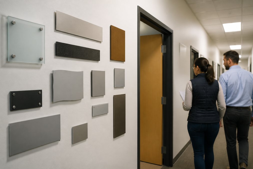
Material selection affects durability and appearance. Durable materials like aluminum, acrylic, and vinyl withstand office environments and maintain appearance over years. Consider maintenance requirements when selecting materials.
Testing before full implementation prevents costly mistakes. Create mockups or samples of your proposed signage and install them in actual locations. Evaluate readability, placement, and visual impact under real conditions. Gather feedback from employees and visitors.
At GBCJ Los Angeles, we work with clients to develop signage strategies that serve their specific needs. Whether you're refreshing a single conference room or redesigning your entire office's visual communication, the principles remain consistent: clarity, consistency, accessibility, and function.
Maintenance and Lifecycle Planning for Signage
Many businesses treat signage as a one-time installation project, then ignore it until it deteriorates. Maintenance planning should begin when you design your signage system. Different materials require different care. Vinyl signs need regular cleaning to remain visible and vibrant. Painted signage may need touch-ups if it chips or fades. Illuminated signs require periodic bulb replacement and electrical inspection.
Material durability varies significantly. High-quality materials last longer and maintain appearance better than budget options. While cost matters, investing in durable materials reduces long-term maintenance expenses and keeps your signage looking professional.
Regular inspections catch maintenance issues before they become obvious problems. A quarterly walkthrough identifying maintenance needs prevents your signage from deteriorating. A small touch-up prevents the need for complete replacement later.
Lifecycle planning means anticipating when signage will need replacement. Most quality signage lasts 5-10 years depending on materials and conditions. Plan budget for periodic updates rather than being caught off-guard when signs fail.
Conclusion
Office signage design mistakes compound over time. Poor readability frustrates employees and confuses visitors. Incorrect placement defeats navigation efforts. Accessibility oversights create legal exposure. Color and contrast problems undermine visibility. Visual clutter overwhelms instead of communicates.
The businesses that get signage right treat it as a system rather than decoration. They prioritize function over aesthetics, consistency over novelty, and accessibility over cost-cutting. They understand that signage is environmental graphics that shapes how people experience and navigate their spaces.
If your office signage needs attention, start with an honest assessment. Walk your space as a visitor and identify pain points. Evaluate whether your current signage meets ADA standards. Consider whether your signage system feels cohesive or scattered.
GBCJ Los Angeles specializes in creating office signage that works. Our team brings over 15 years of experience designing signage systems that combine professional aesthetics with practical functionality. We handle typography, color strategy, placement logic, and accessibility compliance so your office communicates clearly and your brand identity shines. Contact us to discuss how we can improve your office's wayfinding and brand presence.
Frequently Asked Questions
Q: What are the most common mistakes in office signage design?
A: The most frequent errors include poor font choices that reduce legibility, incorrect placement that obstructs sightlines, inadequate color contrast, information overload, and failure to meet ADA compliance standards. These mistakes damage wayfinding efficiency, create a disorganized brand appearance, and can expose your business to accessibility liability. A signage audit early in the design process catches these issues before fabrication.
Q: What are the ADA requirements for office signage?
A: ADA signage requirements for offices mandate specific font sizes, contrast ratios (minimum 3:1), tactile elements like raised letters and Braille, mounting heights between 48-60 inches, and accessible placement that doesn't obstruct traffic. Non-compliance can result in legal action and costly rework. Professional signage designers familiar with ADA standards ensure your interior signage meets federal accessibility regulations while maintaining visual hierarchy and brand consistency.
Q: How do I choose the right font for office wayfinding signs?
A: Best fonts for office wayfinding signs prioritize legibility over decorative style. Sans-serif typefaces like Helvetica, Arial, or Verdana work best because they're easy to read at a distance. Avoid thin fonts, decorative scripts, or all-caps text that increases cognitive load. Font weight should be bold enough for viewing distance, generally, font size should be 1 inch per 10 feet of viewing distance. Consistent typography across your signage system reinforces brand identity while improving navigational clarity.
Q: Why is maintenance planning important for office signage?
A: Office signage experiences wear from foot traffic, environmental exposure, and accumulated dust or damage. Without a maintenance plan, faded colors, peeling materials, and deteriorating legibility damage your professional image and can accelerate material failure. Lifecycle planning, including material durability assessment, cleaning schedules, and replacement timelines, protects your investment and ensures your signage maintains visual impact and compliance over time.