 ultimate-guide
Why High Contrast Store Signs Drive Retail Sales
Table of Contents
- Why High Contrast Signs Are the Difference Between Being Seen and Being Skipped
- How Color Contrast Ratio for Outdoor Signs Affects Readability
- ADA Signage Contrast Requirements Every Retailer Should Know
- How to Design Window Decals for Maximum Retail Visibility
- Typography, Font Weight, and Material Finishes That Boost Legibility
- Testing Contrast Before You Print: A Step-by-Step Process
- Common Mistakes That Kill Signage Contrast
- Frequently Asked Questions
Last Updated: September 27, 2026
Why High Contrast Signs Are the Difference Between Being Seen and Being Skipped
A customer walking past your storefront has about three seconds to notice you. High contrast signs win that window because the eye locks onto strong light-dark separation faster than almost any other visual cue. This guide breaks down the contrast ratios, ADA requirements, and material choices that separate a sign people read from one they never register.
The Real Cost of Visual Friction
Visual friction is the mental effort a shopper spends decoding your sign instead of absorbing your message. When contrast is weak, the brain works harder to separate letters from background, and most people don't bother.
How Color Contrast Ratio for Outdoor Signs Affects Readability
The color contrast ratio for outdoor signs determines whether text stays legible across the lighting conditions your storefront faces each day. It compares text luminance against background on a scale from 1:1 (no contrast) to 21:1 (maximum, black on white). Higher ratios mean more reliable legibility.
Contrast Thresholds That Actually Work
For most retail signage, aim for a minimum contrast ratio of 4.5:1 between text and background. That threshold, borrowed from WCAG accessibility guidance, gives you a reliable baseline for legibility. For small text, thin fonts, or signs viewed from a distance, push toward 7:1 or higher.
Three factors shift your target ratio:
- Viewing distance: The farther the reader, the more contrast you need to compensate for atmospheric haze and reduced visual angle.
- Ambient lighting: Signs facing direct sun need higher ratios than shaded interiors because glare washes out subtle differences.
- Text size and weight: Light-weight fonts lose definition faster than bold ones, so they demand more contrast headroom.
ADA Signage Contrast Requirements Every Retailer Should Know
ADA signage contrast requirements apply to any sign that identifies a permanent room or space, and they set a firm floor for how much separation your text needs from its background. The 2010 ADA Standards for Accessible Design require a minimum 70% contrast between characters and their background on interior signs for permanent rooms, plus a non-glare finish.
What the 70% Contrast Figure Actually Measures
The 70% requirement is a percentage of light reflectance, not a luminance ratio like the 4.5:1 figure used in web accessibility. Contrast is calculated by comparing the light reflectance value (LRV) of the characters against the LRV of the background. Characters at 10% LRV on a background at 80% LRV produce roughly 70% contrast, which meets the standard.
Which Signs Fall Under the Standards
ADA rules cover interior signs labeling permanent spaces: restrooms, exits, room numbers, directional signage, and signs identifying a permanent room or space such as a conference room or tenant suite. They don't govern exterior storefront signs or promotional window graphics, though similar contrast principles still improve readability there.
| Sign Type | ADA Applies? | Contrast Guideline |
|---|---|---|
| Restroom and room labels | Yes | 70% minimum, non-glare finish |
| Exterior storefront sign | No | Aim for 4.5:1 or higher |
| Window promotional decals | No | Match storefront contrast targets |
| Directional interior signs | Yes | 70% minimum, tactile characters |
| Temporary promotional signs | No | No federal minimum; follow local code |
Tactile Characters and Mounting Height
Contrast is only one part of ADA sign compliance. Signs identifying permanent rooms must also include raised characters and Braille, mounted 48 to 60 inches from the finished floor to the baseline of the tactile characters (Chapter 7: Signs). The contrast requirement applies to the visual characters; the tactile elements are read by touch.
Local Codes and State Amendments
Federal ADA standards set the floor, but many states and municipalities adopt stricter amendments. Before ordering interior signage, check with your local building department or a signage professional in your jurisdiction, a sign that passes federal review can still be flagged locally if state code adds requirements.
How to Verify Your Sign Meets the Standard
You don't need a laboratory to check contrast. A handheld light meter or a luminance-measuring smartphone app gives a working estimate: measure reflected light from the background and from the characters under the same lighting, then compare. If the difference falls short of 70%, adjust with a darker character color, lighter background, or matte finish to reduce glare.
How to Design Window Decals for Maximum Retail Visibility
Window decals work best when they balance sidewalk visibility with the natural light you let in. The key decisions are how much glass you cover and where the highest-contrast elements sit.
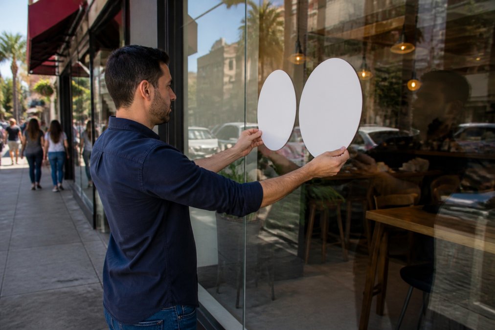
Follow these steps:
- Map your sightlines. Stand where pedestrians actually walk, not where you park.
- Reserve the top third of the glass for your highest-contrast branding, since that zone stays visible above parked cars and crowds.
- Keep promotional text at eye level with a solid or frosted backing panel behind it, so storefront clutter doesn't compete with your message.
- Choose opaque or frosted vinyl over clear where you need text to hold its contrast against a busy interior.
Typography, Font Weight, and Material Finishes That Boost Legibility
Typography and font weight change how much contrast your sign actually delivers. A thin, light-weight font can have a strong color contrast ratio on paper and still read poorly at distance because the strokes are too narrow to hold their shape. Stroke width versus perceived contrast is one of the most overlooked, and easiest to control, factors in signage design.
Stroke Width and the Legibility Threshold
Legibility at distance depends on the angle the strokes subtend in the viewer's eye. A bold or semi-bold weight increases stroke width, so the character holds its shape longer as the viewer moves away. A common rule of thumb: stroke width should be at least 1/5 of character height. A 6-inch letter with a 1-inch stroke reads far better than the same letter with a 1/4-inch stroke, even with the same color pair.
Saturation, Hue, and the Vibration Problem
Saturation and hue matter too. Two highly saturated colors next to each other, red on blue, yellow on green, can create a visual vibration that reduces perceived clarity even when the measured luminance ratio looks acceptable, because the eye's color receptors make the boundary feel unstable. The fix is a neutral buffer: a white or black outline around the text, or a solid backing panel separating the two saturated colors.
How Material Finish Affects Contrast
Material finish plays a role most buyers overlook. Glossy finishes reflect ambient light and create hotspots that wipe out contrast in direct sun, a glossy south-facing sign can lose most of its legibility for hours a day even with high-contrast colors. Matte or satin finishes reduce glare and keep text readable from more angles.
Weather Resistance and Long-Term Contrast
Weather-resistant materials matter just as much for exterior signs, since fading and surface degradation quietly erode contrast. UV exposure breaks down pigments in vinyl and paint, and the background often fades faster than the characters or vice versa. A sign starting at 7:1 can drop below 4.5:1 within a few years if materials aren't rated for outdoor exposure.
Putting It Together
The strongest signage combines a bold sans-serif typeface, high luminance contrast between text and background, a matte or satin finish to control glare, and materials rated for the environment. Each choice reinforces the others: a great typeface on a glossy surface in direct sun still fails, and a matte finish can't rescue a low-contrast color pair.
Testing Contrast Before You Print: A Step-by-Step Process
Testing contrast before printing saves a costly reprint and a sign that underperforms for years. It takes under an hour and catches mistakes invisible on a screen.
- Pull the exact background color you'll use, whether that's vinyl, acrylic, or painted surface.
- Run the color pair through a contrast checker to confirm the ratio meets your target.
- Print a small proof at actual size and view it from the real viewing distance.
- Check it under the lighting conditions your sign will face: midday sun, shade, and evening.
- Photograph the proof in place and review the image, since cameras reveal contrast problems the eye adapts to.
- Adjust and re-test until the sign reads clearly in every condition.
Common Mistakes That Kill Signage Contrast
Signage contrast fails for a handful of predictable reasons, most tracing back to design decisions made without testing in the real environment.
- Relying on color alone. Two colors can look distinct on a monitor and collapse into similar luminance in daylight. Contrast is about light and dark, not just hue.
- Ignoring glare. A glossy finish on a south-facing sign turns midday sun into a mirror that erases your text.
- Using low-contrast brand colors. If your brand palette pairs two mid-tone colors, you'll need a neutral backing panel or outline to create separation.
- Letting busy backgrounds compete. Text over a photographic or patterned background loses visual hierarchy fast.
- Forgetting aging and weather. Fading, dirt, and surface wear reduce contrast gradually, so build in headroom from the start.
Frequently Asked Questions
What are the ADA requirements for signage contrast?
The ADA Standards for Accessible Design require a minimum 70% contrast between characters and their background on permanent room signs, and a non-glare finish. For storefront identification signs, contrast is not federally mandated, but following the same 70% benchmark ensures your sign works for customers with visual impairments and reduces readability complaints. Many local codes in California also reference these standards for commercial signage permits.
How can I test if my store sign has enough contrast?
Use a free online contrast checker that calculates the WCAG contrast ratio between your text color and background color. Aim for at least 4.5:1 for smaller text and 3:1 for large text. You can also photograph your existing sign at different times of day, convert the image to grayscale, and see if the text still stands out. If it disappears in grayscale, your contrast is too low.
What is an example of poor color contrast on a store sign?
Red text on a green background or light gray lettering on a white sign panel are common failures. Both combinations have low luminance differences, so they look muddy from a distance or in bright sunlight. The same problem occurs with glossy finishes that create glare, washing out even strong color pairings. Switching to dark text on a light background or adding a contrasting outline around letters fixes most of these issues.
How does high contrast signage influence customer purchasing decisions?
Signs with strong contrast are read faster and from farther away, which means more drivers and pedestrians register your store before they pass it. That extra second of attention translates into higher foot traffic and more impulse stops. Clear contrast also reduces visual friction, so promotional messages like sale announcements or hours of operation get absorbed without effort, nudging customers who were already nearby to come inside.